In the last section we were introduced to Numpy and the fact that it is a numerical library capable of “basic” numerical analyses on Arrays.
We could use Python to analyse data, and then save the result as comma separated values, which are easily imported into e.g. GraphPad or Excel for plotting.
But why stop using Python there?
Python has some powerful plotting and visualization libraries, that allow us to generate professional looking plots in an automated way.
One of the biggest of these libraries is Matplotlib.
Users of Matlab will find that Matplotlib has a familiar syntax.
For example, to plot a 1d array (e.g. stored in variable arr1d)
as a line plot, we can use
import matplotlib.pyplot as plt
plt.plot(arr1d)
plt.show()
Reminder: aliases
Here we used the alias (
as) feature when importing matplotlib to save having to typematplotlib.pyploteach time we want to access thepyplotsub-module’s plotting functions!
NOTE
In the following notes, most of the time when I refer to “matplotlib’s X
function” (where X is changeable), I’m actually referring to the function
found in matplotlib.pyplot, which is matplotlib’s main plotting
submodule.
show functionWhat’s going on here?
The plot function does just that; it generates a
plot of the input arguments.
However, matplotlib doesn’t (by default) show any plots until the show
function is called. This is an intended feature:
It is possible to change this feature so that plots are shown as soon as they
are created, using matplotlib’s ion function (~ interactive on).
figureOften we need to show multiple figures; by default calling several plot commands, one after the other, will cause each new plot to draw over previous plots.
To create a new figure for plotting, call
plt.figure()
# Now we have a new figure that will receive the next plotting command
Matplotlib is good at performing 2d plotting.
As well as the “basic” plot command, matplotlib.pyplot includes
bar             : Bar plot (also barh for horizontal bars)
barb            : 2d field of barbs (used in meteorology)
boxplot         : Box and whisker plot (with median, quartiles)
contour         : Contour plot of 2d data (also contourf - filled version)
errorbar        : Error bar plot
fill_between    : Fills between lower and upper lines
hist            : Histogram (also hist2d for 2 dimensional histogram)
imshow          : Image "plot" (with variety of colour maps for grayscale data)
loglog          : Log-log plot
pie             : Pie chart
polar           : Polar plot
quiver          : Plot a 2d field of arrows (vectors)
scatter         : Scatter plot of x-y data
violinplot      : Violin plot - similar to boxplot but width indicates distribution
Rather than copying and pasting content, navigate to the Matplotlib Gallery page to view examples of these and more plots.
You’ll find examples (including source code!) for most of your plotting needs there.
First of all, let’s practice plotting 1d and 2d data using some of the plotting functions mentioned above.
Create a new script file (“exercise_mpl_simple.py”), and start off by loading and creating some sample data sets:
Create the following plots and display them to the screen
matplotlib’s
hist function.Loading and generating Numpy arrays is very similar to the exericises in the last section.
All that’s really being added here are some very simple plot functions,
namely plot, hist, and imshow.
For this first example you will either need to call matplotlib’s show
function after each plot is created, or you could create a new figure
for each plot using the figure function, and call show only once
at the end of the script.
# Practice of basic matplotlib plotting commands
import numpy as np
import matplotlib
matplotlib.use("agg")
import matplotlib.pyplot as plt
import os
ROOT = os.path.realpath(os.path.dirname(__file__))
# Load and generate arrays
arr1 = np.loadtxt(os.path.join(ROOT, "growth_data.csv"), delimiter=",")
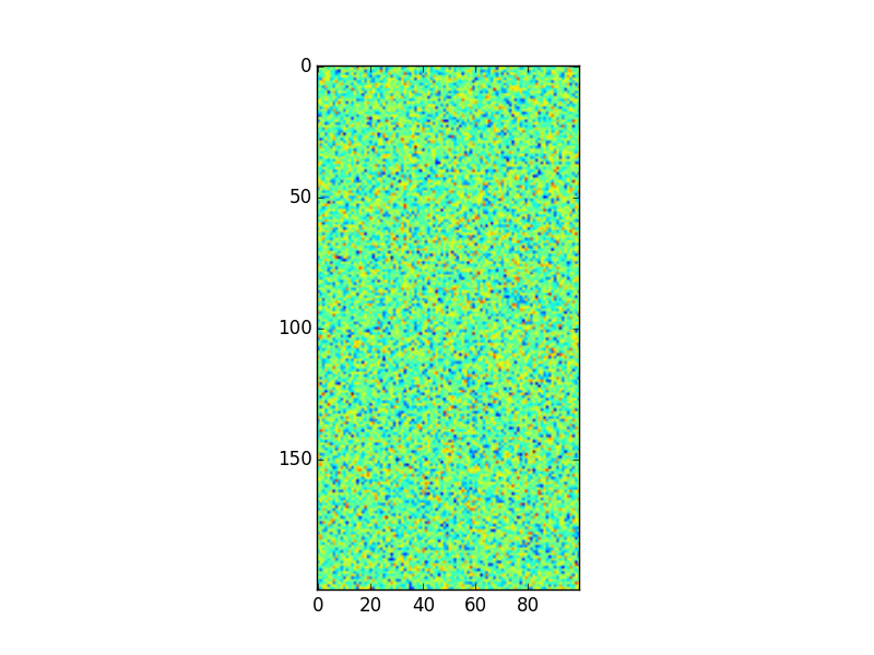
arr2 = 3.14 * np.random.randn(200,100) + 66
# Do plotting
# NOTE: Instead of the `savefig` lines, your code should be calling `plt.show()`!
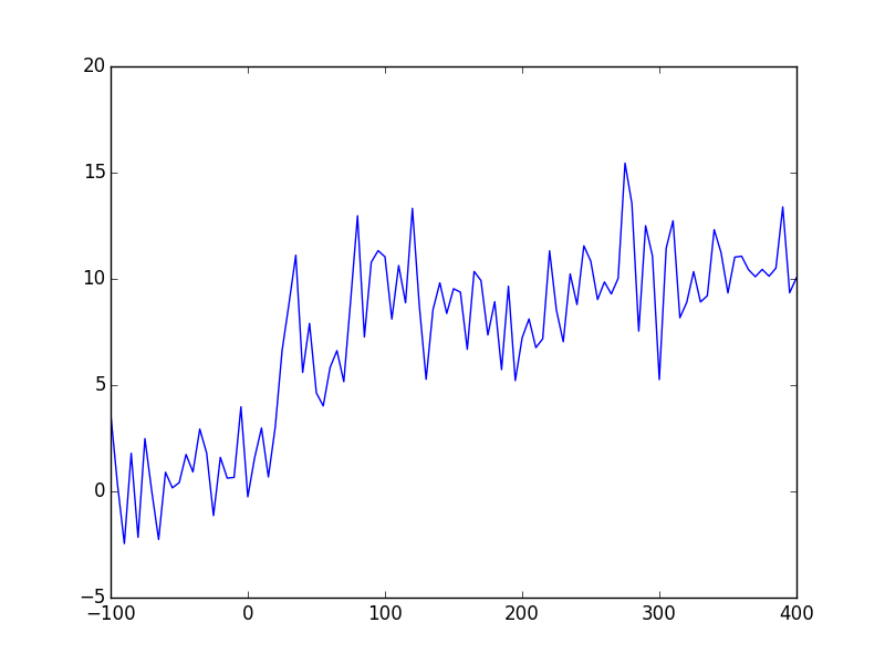
plt.plot(arr1[:,0], arr1[:,1])
plt.savefig("answer_mpl_simple1.png"); plt.clf()
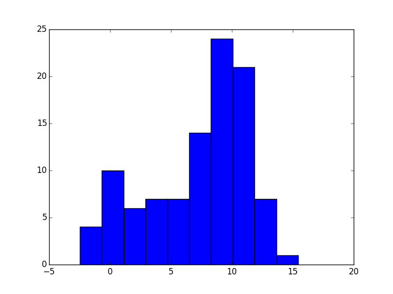
plt.hist(arr1[:,1], bins=10)
plt.savefig("answer_mpl_simple2.png"); plt.clf()
plt.imshow(arr2)
plt.savefig("answer_mpl_simple3.png"); plt.clf()
This should produce the following plots:
Most plotting functions allow you to specify additional keyword arguments, which determine the plot characteristics.
For example, a the line plot example may be customized to have a red dashed line and square marker symbols by updating our first code snippet to
plt.plot(arr1d, '--', color="r", marker="s")
(or the shorthand plt.plot(arr1d, "--r"))
Additional figure and axes properties can also be modified. To do so, we need to access figure/axis respectively.
To create a new (empty) figure and corresponding figure object,
use the figure function:
fig1 = plt.figure()
# Now we can modify the figure properties, e.g.
# we can set the figure's width (in inches - intended for printing!)
fig1.set_figwidth(10)
# Then setting the figure's dpi (dots-per-inch) will determine the
# number of pixels this corresponds to...
fig1.set_dpi(300)       # I.e. the figure width will be 3000 px!
If instead we wish to modify an already created figure object,
we can either get a figure object by passing it’s number propery
to the figure function e.g.
f = plt.figure(10) # Get figure number 10
or more commonly, we get the active figure (usually the last created figure) using
f = plt.gcf()
Axes are handled in a similar way;
ax = plt.axes()
creates a default axes in the current figure (creates a figure if none are present), while
ax = plt.gca()
gets the current (last created) axes object.
Axes objects give you access to changing background colours, axis colours, and many other axes properties.
Some of the most common ones can be modified for the current axes without
needing to access the axes object as matplotlib.pyplot has convenience
functions for this e.g.
plt.title("Aaaaarghh")          # Sets current axes title to "Aaaaarghh"

plt.xlabel("Time (s)")          # Sets current axes xlabel to "Time (s)"
plt.ylabel("Amplitude (arb.)")  # Sets current axes ylabel to "Amplitude (arb.)"

# Set the current axes x-tick locations and labels
plt.yticks( numpy.arange(5), ('Tom', 'Dick', 'Harry', 'Sally', 'Sue') )
Matplotlib’s default plotting styles are often not considered to be desirable, with critics citing styles such as the R package ggplot’s default style as much more “professional looking”.
Fortunately, this criticism has not fallen on deaf ears, and while it has always been possible to create your own customized style, Matplotlib now includes additional styles by default as “style sheets”.
In particular, styles such as ggplot are very popular and essentially emulate ggplot’s style (axes colourings, fonts, etc).
The style may be changed before starting to plot using e.g.
plt.style.use('ggplot')
A list of available styles may be accessed using
plt.style.available
(on the current machine this holds : ['dark_background',
'fivethirtyeight', 'bmh', 'grayscale', 'ggplot'])
You may define your own style file, and after placing it in a specific folder ( “~/.config/matplotlib/mpl_configdir/stylelib” ) you may access your style in the same way.
Styles may also be composed together using
plt.style.use(['ggplot', 'presentation'])
where the rules in the right-most style will take precedent.
Repeat the simple plotting exercise with the "ggplot" style;
to do this, copy and paste the code from the simple plotting exercise
but add the code to change the style to the ggplot style
before the rest of the code.
To change the style to ggplot, simply add
plt.style.use('ggplot')
after having imported matplotlib.pyplot (as plt).
While matplotlib includes basic 3d plotting functionality (via mplot3d),
we recommend using a different library if you need to generate
“fancy” looking 3d plots.
A good alternative for such plots isa package called mayavi.
However this is not included with WinPython and the simplest route to installing it involves installing the Enthough Tool Suite (http://code.enthought.com/projects/).
For the meantime though, if you want to plot 3d data, stick with the mplot3d
submodule.
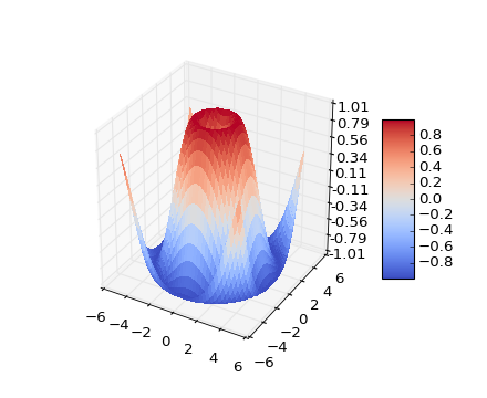
For example, to generate a 3d surface plot of the 2d data (i.e. the “pixel” value would correspond to the height in z), we could use
import matplotlib.pyplot as plt
from mpl_toolkits.mplot3d import Axes3D
fig = plt.figure()
ax = fig.add_subplot(111, projection='3d')
ax.plot_surface(X, Y, Z)
where X, Y, Z are 2d data values.
X and Y are 2d representations of the axis values which can be
generated using utility functions, e.g. pulling an example from the
Matplotlib website,
from mpl_toolkits.mplot3d import Axes3D
from matplotlib import cm
from matplotlib.ticker import LinearLocator, FormatStrFormatter
import matplotlib.pyplot as plt
import numpy as np

fig = plt.figure()
ax = fig.gca(projection='3d')
X = np.arange(-5, 5, 0.25)
Y = np.arange(-5, 5, 0.25)
X, Y = np.meshgrid(X, Y)
R = np.sqrt(X**2 + Y**2)
Z = np.sin(R)
surf = ax.plot_surface(X, Y, Z, rstride=1, cstride=1, cmap=cm.coolwarm,
                       linewidth=0, antialiased=False)
ax.set_zlim(-1.01, 1.01)

ax.zaxis.set_major_locator(LinearLocator(10))
ax.zaxis.set_major_formatter(FormatStrFormatter('%.02f'))

fig.colorbar(surf, shrink=0.5, aspect=5)

plt.show()
Now that we have an idea of the types of plots that can be generated using Matplotlib, let’s think about saving those plots.
If you call the show command, the resulting figure window includes
a basic toolbar for zooming, panning, and saving the plot.
However, as a Pythonista, you will want to automate saving the plot (and probably forego viewing the figures until the script has batch processed your 1,000 data files!).
The command to save the currently active figure is
plt.savefig('filename.png')
Alternatively, if you store the result of the
plt.figure() function in a variable as mentioned above
you can subsequently use the savefig member-function
of that figure object to specifically save that figure, even if
it is no longer the active figure; e.g.
fig1 = plt.figure()

#
# Other code that generates more figures
#
# ...
#


fig1.savefig('figure1.pdf')
The filename extension that you specify in the savefig function
determines the output type; matplotlib supports
as well as several others.
The first two formats are known as raster formats, which means that the entire figure is saved as a bunch of pixels.
This means that if you open the resulting file with an image viewer, and zoom in, eventually the plot will look pixelated/blocky.
The second two formats are vector formats, which means that a line plot is saved as a collection of x,y points specifying the line start and end points, text is saved as a location and text data and so on.
If you open a vector format file with e.g. a PDF file viewer, and zoom in, the lines and text will always have smooth edges and never look blocky.
As a general guideline, you should choose to mainly use vector file (pdf, eps, or svg) output for plots as they will preserve the full data, while raster formats will convert the plot data into pixels.
In addition, if you have vector image editing software like Inkscape or Adobe Illustrator, you will be able to open the vector image and much more easily change line colours, fonts etc.
We already saw how to add a title and x and y labels; below are some more examples of annotations that can be added.
You could probably guess most of what the functions do (or have guessed what the function would be called!):
plt.title("I'm a title") # Note single quote inside double quoted string is ok!
plt.xlabel("Time (${\mu}s$)")       # We can include LaTex for symbols etc...
plt.ylabel("Intensity (arb. units)")

plt.legend("Series 1", "Series 2")

plt.colorbar()      # Show a colour-bar (usually for image data).

# Add in an arrow
plt.arrow(0, 0, 0.5, 0.5, head_width=0.05, head_length=0.1, fc='k', ec='k')
The last command illustrates how as with most
most plotting commands, arrow accepts a
large number of additional keyword arguments (aka kwargs) to
customize colours (edge and face), widths, and many more properties.
Create a new script file (exercise_mpl_raster_vs_vector.py) and create
a simple line plot of y=x^2 between x=-10 and x=10.
Add in labels for the x and y axis; call the x axis, "x (unitless)" and the
y axis “y = x^2” (see if you can figure out how to render the squared symbol, i.e.
a super-script 2; those of you familiar with LaTex should find this easy!).
Save the plot as both a png and pdf file, and open both side-by-side. Zoom in to compare the two formats.
To generate the x and y data use Numpy’s linspace function for x, and the generate the y data from
the x data.
To render mathematical symbols, use the latex expression: “$x^2$” - if you’re not familiar with LaTex and don’t care about being able to render mathematical expressions and symbols, don’t worry about this!
Otherwise, you might want to read up about mathematical expressions in LaTex.
Use the plt.savefig function to save the figure twice, once with file extension (the end of the
filename) png, and once with extension pdf.
There are two common approaches to creating sub-plots.
The first is to create individual figures with well thought out sizes (especially font sizes!), and then combine then using an external application.
Matplotlib can also simplify this step for us, by providing subplot functionality. We could, when creating axes, reposition them ourselves in the figure. But this would be tedious, so Matplotlib offers convenience functions to automatically lay out axes for us.
The older of these is the subplot command, which lays axes out in a regular
grid.
For example
plt.subplot(221)        # Create an axes object with position and size for 2x2 grid
plt.plot([1,2,3])
plt.title("Axes 1")

plt.subplot(222)
plt.plot([1,2,3])
plt.title("Axes 2")

plt.subplot(223)
plt.plot([1,2,3])
plt.title("Axes 3")

plt.subplot(224)
plt.plot([1,2,3])
plt.title("Axes 4")
Note that the subplot command uses 1-indexing of axes (not 0-indexing!).
The above could be simplified (at least in some scenarios) using a for-loop,
e.g.
# datasets contains 4 items, each corresponding to a 1d dataset...
for i, data in enumerate(datasets):
    plt.subplot(2,2,i+1)
    plt.plot(data)
    plt.title("Data %d"%(i+1))
Recently, Matplotlib added a new way of generating subplots, which makes it easier to generate non-uniform grids.
This is the subplot2grid function, which is used as follows,
ax1 = plt.subplot2grid((3,3), (0,0), colspan=3)
ax2 = plt.subplot2grid((3,3), (1,0), colspan=2)
ax3 = plt.subplot2grid((3,3), (1, 2), rowspan=2)
ax4 = plt.subplot2grid((3,3), (2, 0))
ax5 = plt.subplot2grid((3,3), (2, 1))
would generate
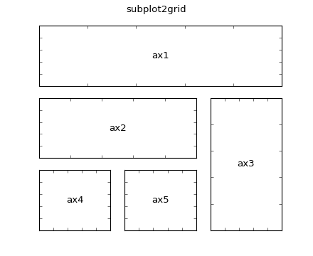 (without the labels!)
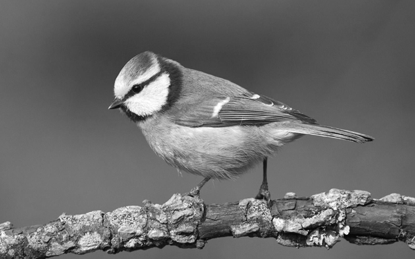
Download the image from here: Image File.
Create a new script (“exercise_mpl_gridplots.py”), and
matplotlib.pyplot’s imread convenience function2x6
---------
| c 8x2 |
------------
| || |
| b ||a|
| 8x6 || |
| || |
------------
Here,
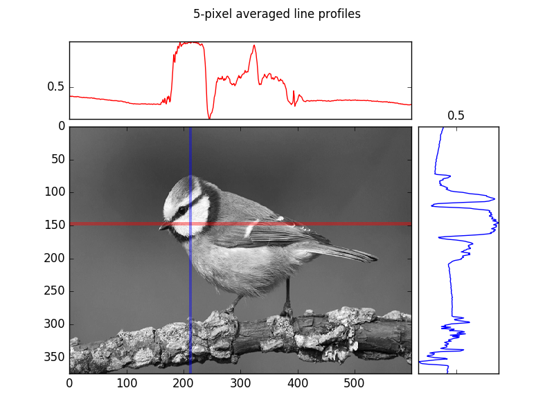
Next create a similar subplot figure but this time, instead of performing maximum projections along the x and y axes, generate the following mean line-profiles:
The main thing we’re practicing here is the use of the subplottling functionalities in Matplotlib.
Using subplot2grid will make this much easier than trying to
manually position axes in the figure.
A maximum projection means for the given dimension (e.g. row or column), extract the maximum value of the image (array) each for row or column.
A basic line profile means given a line (in our case horizontal and vertical lines, which correspond to rows and columns of the array respectively), simply pull out those values and plot them as a 1d plot.
An often more robust version of the simple line profile, is a line profile of finite (> 1 pixel) width that is averaged at each point along the line across the pixels along the width. Put another way, visualize first of all a rectangle instead of a line, and perform a mean-projection of the rectangular (2d) array of values. The resulting 1d array of values is the width-meaned line profile.
If you’d like more information about generating the maximum projections or the line profiles, ask a demonstrator.
# Create a subplot figure

# NOTE: You shouldn't need the following 2 lines, yet, but they're useful for
# "headless" plotting (i.e. on machines with no display)
import matplotlib
matplotlib.use('agg')

import matplotlib.pyplot as plt
import numpy as np

# "Usual" script folder extraction method (as used in many previous exercises!)
import os
SCRIPT_DIR = os.path.realpath(os.path.dirname(__file__))

# Load the data
im = plt.imread(os.path.join(SCRIPT_DIR, "grayscale.png"))

# Take the mean of the RGB channels (dims are Width, Height, Colour Channels)
# (up to 3 as "Alpha" aka opacity channel also included at index 3)
im = im[...,:3].mean(axis=-1)


# Maximum projections using the Numpy Array max member-function with
# axis keyword argument to select the dimension to "project" along.
maxx = im.max(axis=0)
maxy = im.max(axis=1)#[-1::-1]

def plot_im_and_profiles(im, palongx, palongy, cx = "b", cy = "b"):
    """
    Use a function to do the plotting as we do essentially the same thing
    more than once, ie generate an image plot with the line-profile plots
    above and to the right of the image plot
    """
    # Create 3 axes with specified grid dimensions
    ax_a = plt.subplot2grid((8,10), (2,8), colspan=2, rowspan=6)
    ax_a.plot(palongy, np.arange(len(palongy)), color=cy)
    ax_a.locator_params(tight=True, nbins=4)
    ax_a.xaxis.set_tick_params(labeltop="on", labelbottom='off')
    ax_a.yaxis.set_visible(False)
    ax_b = plt.subplot2grid((8,10), (2,0), colspan=8, rowspan=6)
    ax_b.imshow(im, cmap='gray')
    plt.axis('tight')# ax_b.
    ax_c = plt.subplot2grid((8,10), (0,0), colspan=8, rowspan=2)
    ax_c.plot(palongx, color=cx)
    ax_c.locator_params(tight=True, nbins=4)
    ax_c.xaxis.set_visible(False)
    # Return the axes objects so we can easily add things to them
    # in our case we want to add an indication of where the line
    # profiles are taken from
    return ax_a, ax_b, ax_c

plot_im_and_profiles(im,maxx, maxy[-1::-1])
# Suptitle gives a whole figure a title
# (as opposed to individual axes
plt.suptitle("Whole image maximum projections")
plt.savefig(os.path.join(SCRIPT_DIR, "answer_mpl_subplot1.png"))
# Now add in a "line-profile", width 5 and averaged
# at y ~ 145 and x ~ 210
profx = im[145:150, :].mean(axis=0)
profy = im[:, 210:215].mean(axis=1)[-1::-1]
ax_a, ax_b, ax_c  = plot_im_and_profiles(im,profx, profy, cx="r", cy="b")
# Show the line profile regions using `axvspan` and `axhspan`
ax_b.axhspan(145,150, fc = "r", ec="none", alpha=0.4)
ax_b.axvspan(210,215, fc = "b", ec="none", alpha=0.4)
plt.suptitle("5-pixel averaged line profiles")
plt.savefig(os.path.join(SCRIPT_DIR, "answer_mpl_subplot2.png"))
This generates the following two figures:
If you would like to further practice Matplotlib, please visit this resource.