1 Visualisation using ggplot2
Let’s start with a motivating example.
1.1 Gapminder
Professor Hans Rosling has made a name for himself in the field of data visualisation with his groundbreaking Gapminder project.
For a slightly longer presentation, his TED talk on global development has been watched over 11 million times. If you have 20 minutes, it can be found here, and is well worth a watch!
More-or-less as I had finished the first version of these notes, the news broke that Professor Rosling had sadly passed away on 7th February 2017, aged 68. I hope you will find some time to explore the Gapminder website, and appreciate the immense contribution that he made to the world of public health and education. He presented a world-view based on facts and data. To this end he provided innovative and fascinating ways to explore and understand data, disseminated these findings with pathos and humour, and used this information to challenge many of our pre-conceptions about public health and the developing world. An obituary from the Guardian can be found here.
The Gapminder website provides really informative interactive visualisations for many fascinating data sets. In this pracical we will explore how to use R to try to recreate something similar to the types of visualisation that Gapminder provides, and see how high-end R packages—such as ggplot2—have been developed that provide a systematic and flexible way to generate complex plots / visualisations. Our aim for this workshop is to emulate the plot in Figure 1.1.
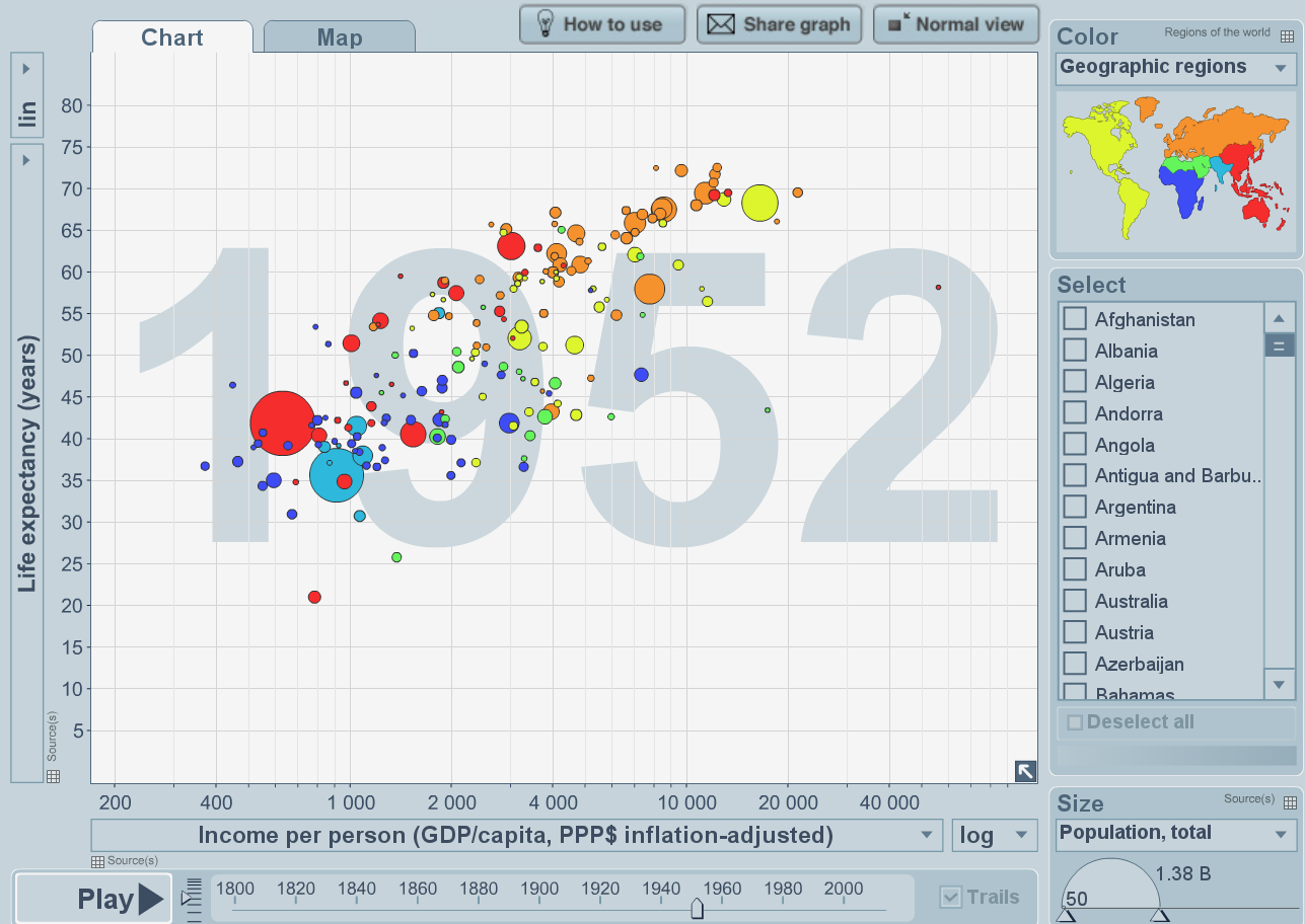
Figure 1.1: Life expectancy against GDP—screenshot from Gapminder project
Before we do this, let’s quickly remind ourselves of basic plotting functionality in R.
1.2 Base R graphics
Let’s begin by exploring the iris data set, which gives the measurements in centimeters of the variables sepal length and width, and petal length and width, respectively, for 50 flowers from each of 3 species of iris. The species are Iris setosa, versicolor, and virginica. This data set is available as part of the base R package. Let’s have a look at the data:
head(iris)## Sepal.Length Sepal.Width Petal.Length Petal.Width Species
## 1 5.1 3.5 1.4 0.2 setosa
## 2 4.9 3.0 1.4 0.2 setosa
## 3 4.7 3.2 1.3 0.2 setosa
## 4 4.6 3.1 1.5 0.2 setosa
## 5 5.0 3.6 1.4 0.2 setosa
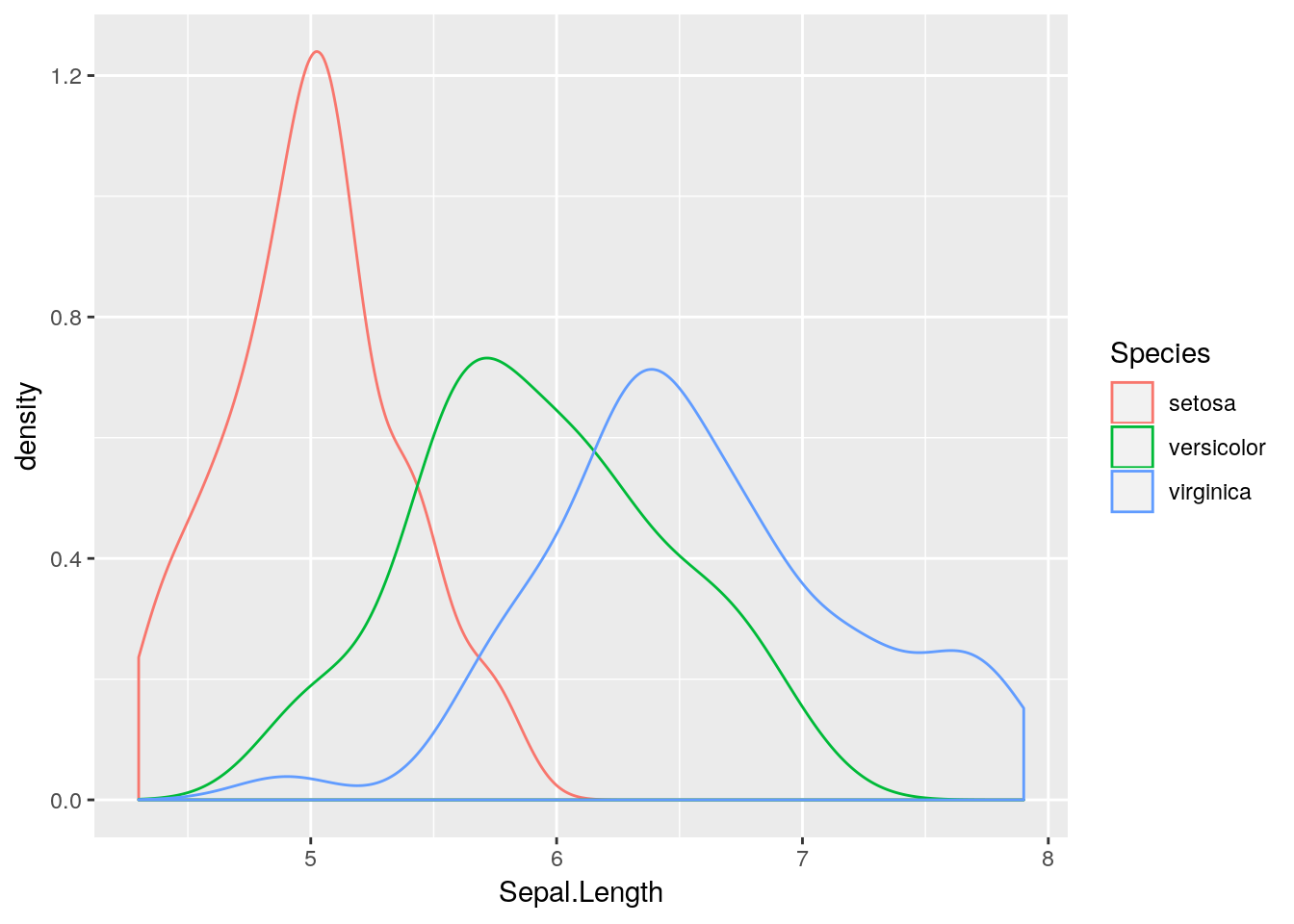
## 6 5.4 3.9 1.7 0.4 setosaLet’s start by visualising the variable Sepal.Lengthusing a kernel density plot:.
## kernel density of sepal length
plot(density(iris$Sepal.Length))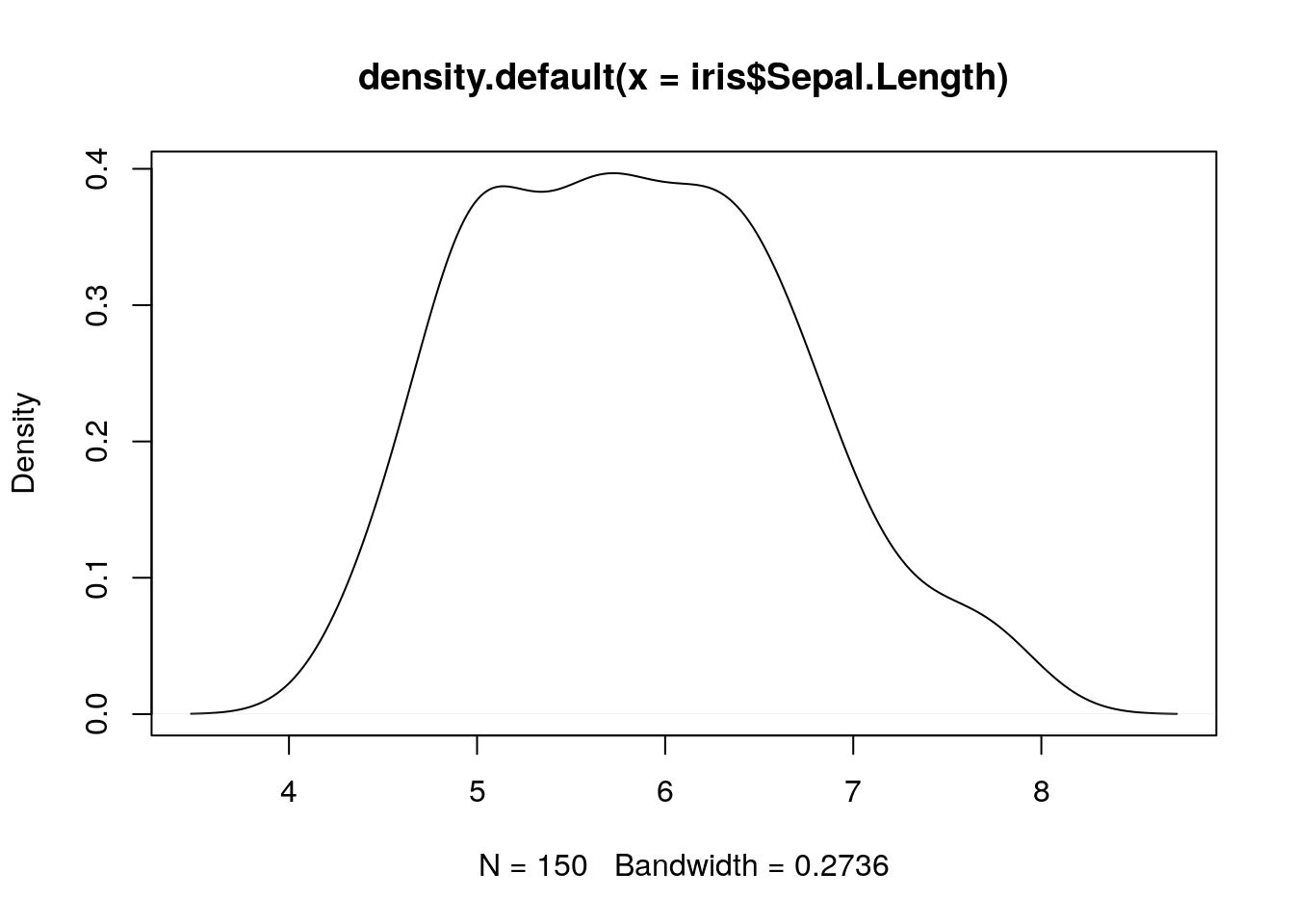
Remember that we can extract a named column from a
data.frameusing the$operator. Thedensity()function is a simple function in R that takes avectorargument and returns a kernel density object, which we can then plot using the genericplot()function.
Now let’s try to plot different kernel density plots for the three different species. We could do this as separate plots, and use our standard subsetting notation to extract the correct elements of the data frame in each case:
## plot Sepal.Length for setosa
plot(density(iris$Sepal.Length[iris$Species == "setosa"]))
## plot Sepal.Length for versicolor
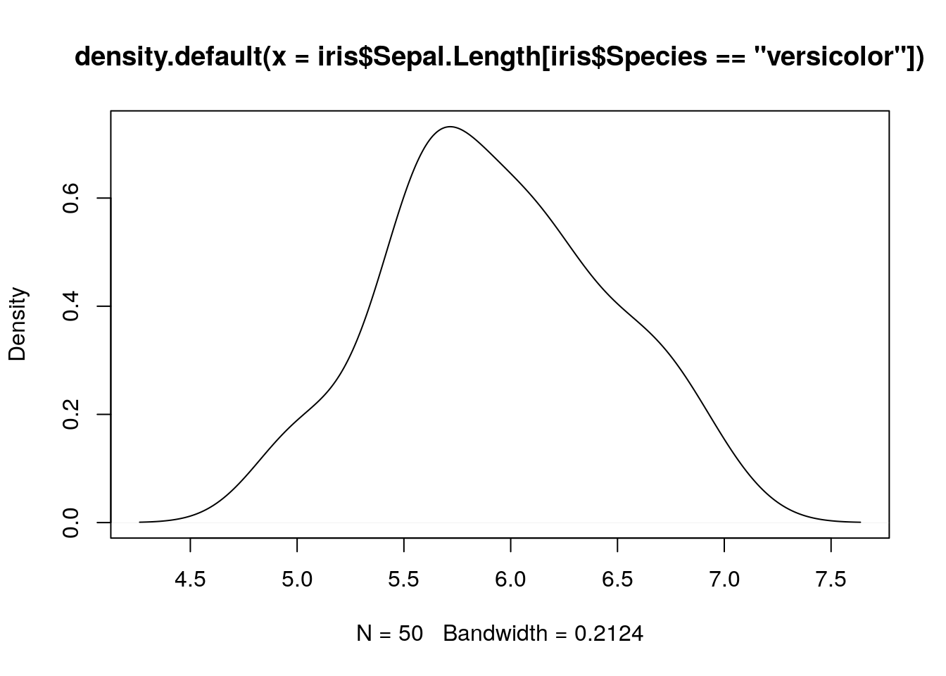
plot(density(iris$Sepal.Length[iris$Species == "versicolor"]))
## plot Sepal.Length for virginica
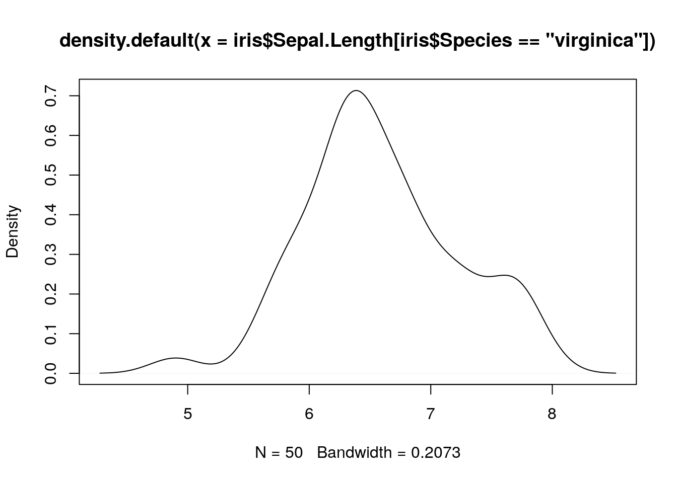
plot(density(iris$Sepal.Length[iris$Species == "virginica"]))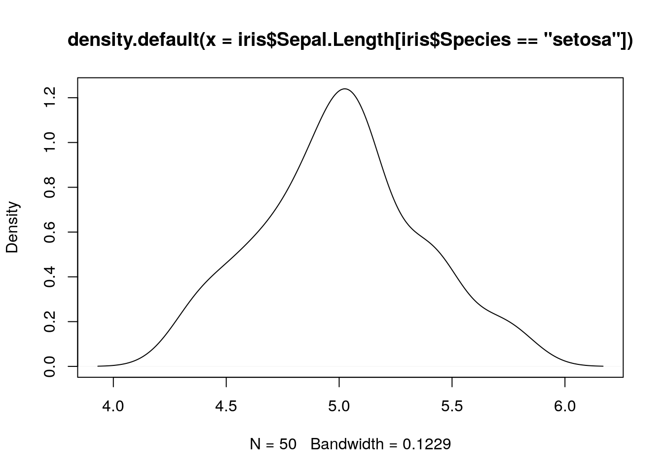
What about if we want to add all three density lines to the same plot?
## place kernel density estimates on the same plot
plot(density(iris$Sepal.Length[iris$Species == "setosa"]), main = "")
lines(density(iris$Sepal.Length[iris$Species == "versicolor"]))
lines(density(iris$Sepal.Length[iris$Species == "virginica"]))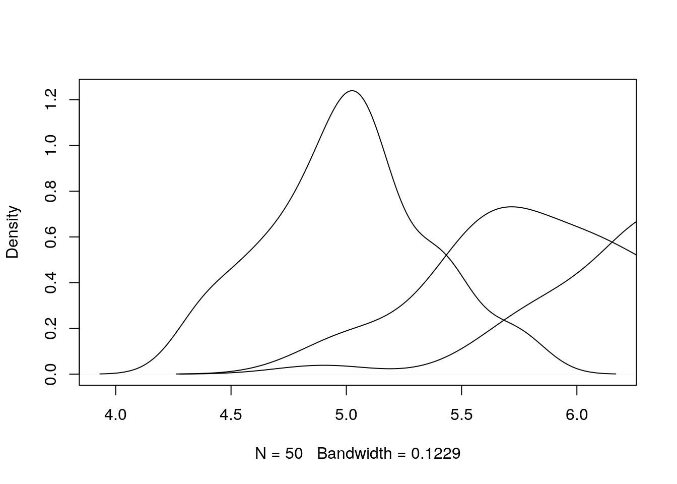
Notice the use of the
lines()function to allow a line to be added to an existing plot.
Notice that the limits of the \(x\)- and \(y\)-axes in this case are set by the range of the initial setosa sepal lengths, and hence the density plots for the other two species extend beyond the plot window. Let’s try again, but this time setting the bounds for the plots manually. To do this we calculate the \(x\) and \(y\) ranges for each density plot separately, and then take the maximum values across the different species. We then use the xlim and ylim arguments to the plot() function in order to set the ranges:
## produce densities
setosa_dens <- density(iris$Sepal.Length[iris$Species == "setosa"])
versicolor_dens <- density(iris$Sepal.Length[iris$Species == "versicolor"])
virginica_dens <- density(iris$Sepal.Length[iris$Species == "virginica"])

## extract x-ranges and y-ranges
xlims <- range(c(setosa_dens$x, versicolor_dens$x, virginica_dens$x))
ylims <- range(c(setosa_dens$y, versicolor_dens$y, virginica_dens$y))

## produce plot
plot(density(iris$Sepal.Length[iris$Species == "setosa"]),
     xlim = xlims, ylim = ylims, main = "")
lines(density(iris$Sepal.Length[iris$Species == "versicolor"]))
lines(density(iris$Sepal.Length[iris$Species == "virginica"]))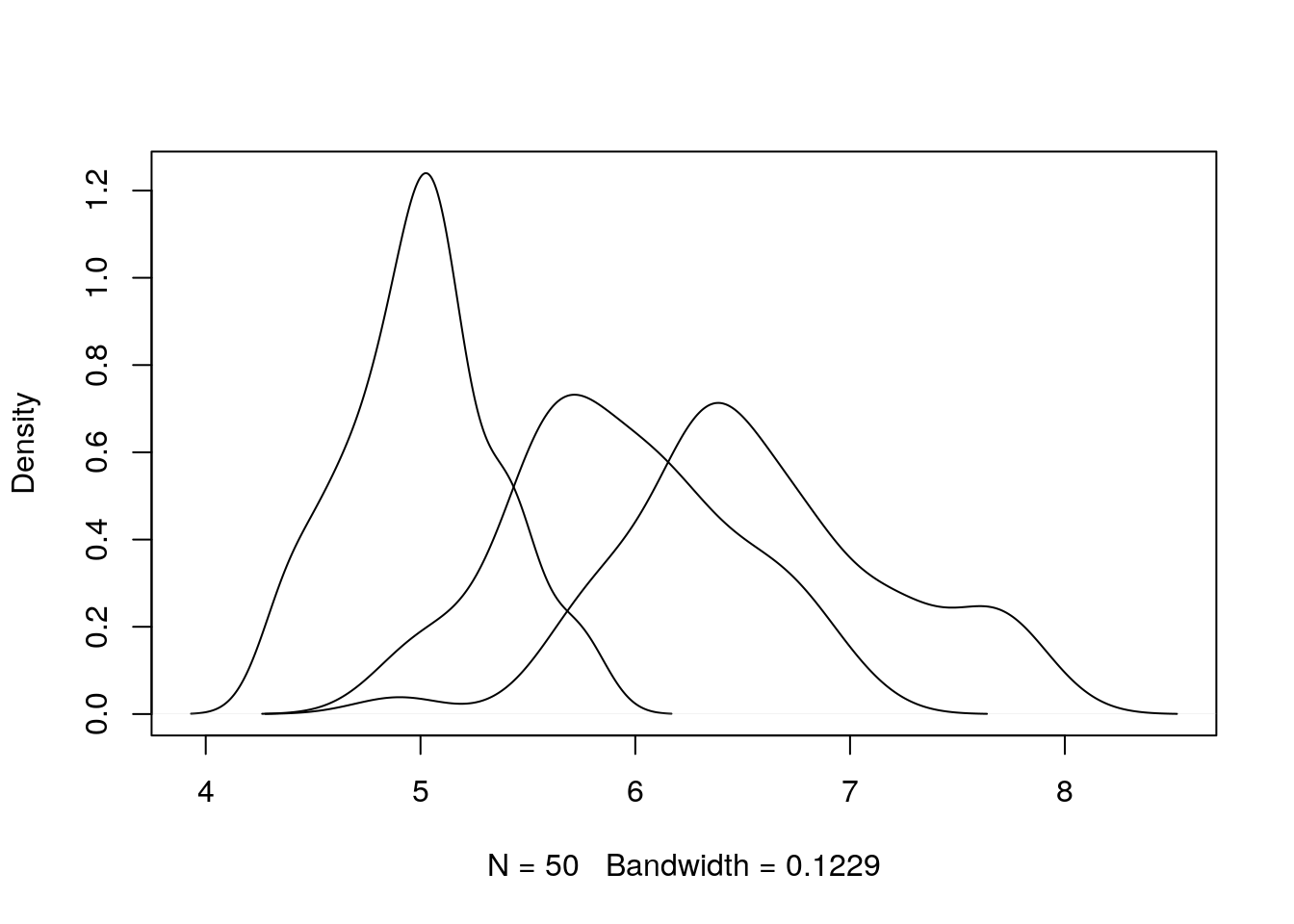
This is better, but still not very informative. Let’s add some colour and a legend, and tidy up the axis labels.
## produce plot
plot(density(iris$Sepal.Length[iris$Species == "setosa"]),
    xlim = xlims, ylim = ylims, main = "", xlab = "Sepal Length (cm)")
lines(density(iris$Sepal.Length[iris$Species == "versicolor"]), col = "red")
lines(density(iris$Sepal.Length[iris$Species == "virginica"]), col = "blue")

## add legend to top-right corner
legend(par("usr")[2] * 0.8, par("usr")[4] * 0.95,
       legend = c("setosa", "versicolor", "virginica"),
       lty = c(1, 1, 1),
       col = c("black", "red", "blue"))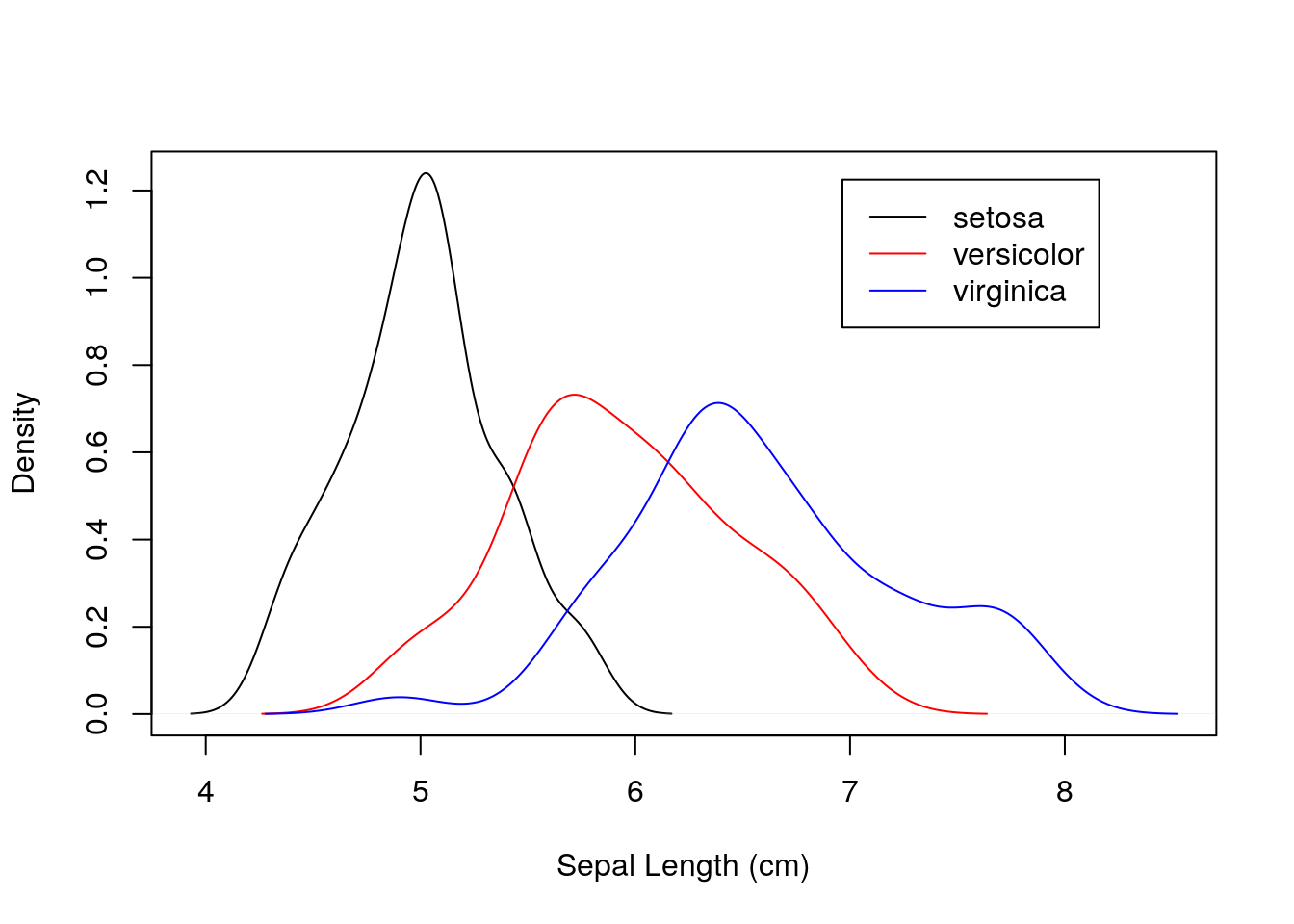
Notice that this is quite a simple plot, but required a series of steps to render in base R. We needed to calculate manual limits for the axes, plot the three species separately, and then add a custom legend to the plot.
Let’s look at another quick example. This time, let’s plot sepal length against sepal width for the three species.
## produce scatterplot
plot(iris$Sepal.Length, iris$Sepal.Width,
     xlab = "Sepal Length (cm)", ylab = "Sepal Width (cm)")
points(iris$Sepal.Length[iris$Species == "versicolor"],
       iris$Sepal.Width[iris$Species == "versicolor"], col = "red")
points(iris$Sepal.Length[iris$Species == "virginica"],
       iris$Sepal.Width[iris$Species == "virginica"], col = "blue")

## add legend
legend(par("usr")[2] * 0.8, par("usr")[4] * 0.98,
       legend = c("setosa", "versicolor", "virginica"),
       pch = c(1, 1, 1),
       col = c("black", "red", "blue"))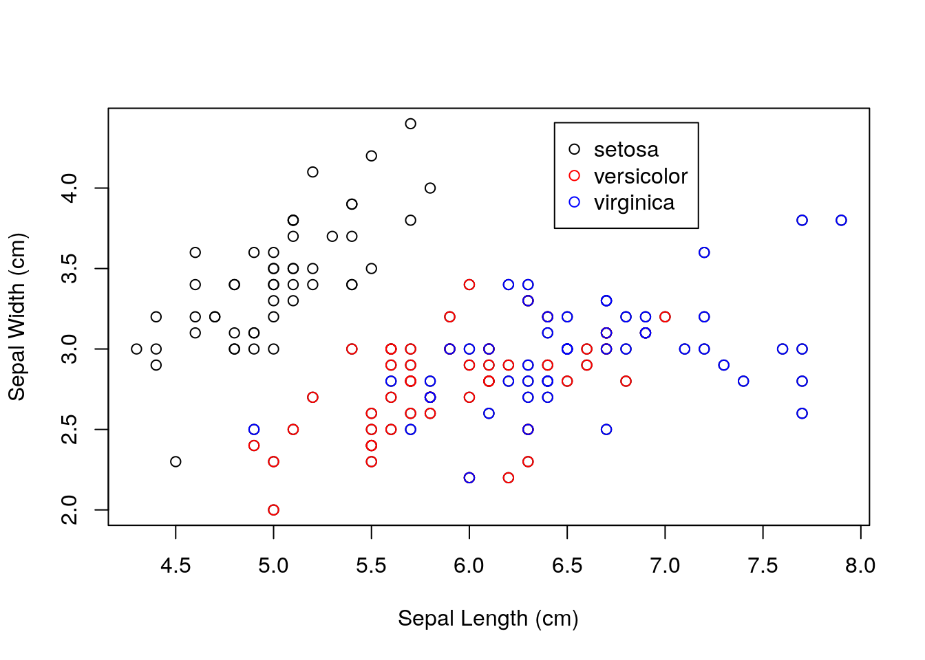
Notice the use of the
points()function to add points to an existing plot. We could set the position of the legend manually, but the objectspar("usr")provides the coordinates of the plot region in the formc(x1, x2, y1, y2), wherex1is the lower bound for the \(x\)-axis, andx2is the upper bound for the \(x\)-axis, and similarly fory1andy2.
1.3 Introduction to ggplot2
We have seen that the R base graphics system is highly flexible, and it can be used to produce high-quality, bespoke visualisations. However, doing so can be a lot of work! Let’s show an alternative way to produce similar plots using the ggplot2 package. We will introduce the code first, and then talk through it.
First we load the tidyverse (of which ggplot2 is included).
library(tidyverse)Now run
ggplot(iris) +
    geom_point(aes(x = Sepal.Length, y = Sepal.Width, colour = Species))
Notice that we had to do little physical manipulation of the plot. We didn’t have to choose how to position legends, or manually subset the data to plot the different points, or choose the colours; the package took care of all of these things.
So, how does it work? ggplot2 is based on a book called the Grammar of Graphics by Leland Wilkinson—hence the name gg-plot! The ethos of ggplot2 is that plots can be broken down into different features, most notably:
- data;
- aesthetic mapping;
- geometric object;
- scales;
- faceting;
- statistical transformations;
- coordinate system;
- position adjustments.
Perhaps the easiest way to explain some of these concepts is to work through our examples step-by-step. We will focus on the main components marked in bold above. Let’s start with the scatterplot example first, and examine the first part of the code:
ggplot(iris)
This sets up the plot. The first argument to the ggplot function is the data, which here is the iris data set.
Important: whereas base R graphics can plot various object types,
ggplot()requiresdata.frame(ortibble1) objects. It is designed for plotting statistical data sets. Never fear, most R objects can be manipulated intodata.framesfor plotting if required. (See next session on data wrangling.)
1.3.1 Aesthetics
The aes(x = Sepal.Length, y = Sepal.Width, colour = Species) part sets the aesthetics, which here are added as an argument to the geom_point() function (see nect section). These define how the data are mapped onto the visual aesthetics of the plot. Here we are setting the x coordinates to be Sepal.Length, the y coordinates to be Sepal.Width, and the colour of the characters to be related to Species. In general, aesthetics include:
- position;
- colour (border or line color);
- fill (inside color);
- shape;
- linetype;
- size.
As usual, information can be found in the relevant help files, but a really useful resource for
ggplot2is the Data Visualisation Cheat Sheet. Another fantastic resource, is the R Graphics Cookbook by Winston Chang, which has a free online version, or a physical book that you can buy.
Notice that we did not have to use the
$operator to extract columns. This makesggplot2code a lot clearer. R knows to look for theSepal.LengthandSepal.Widthcolumns in theirisdata, because we have toldggplot()which data set to operate on.
1.3.2 Geoms
A geom defines the type of plot we want. In this case we want a scatterplot, which can be defined by the geom_point() function. Geoms can be layered, allowing us to built complex plots in different ways. Common geoms are:
geom_point()geom_line()geom_histogram()geom_density()geom_bar()geom_violin()
Please see the Data Visualisation Cheat Sheet for more examples.
Note: ggplot2 builds plots up by adding together components. There are lots of ways to do this. Here I have set up “global” options for the plot using the ggplot() function. I then add (+) to this the type of plot I want i.e. + geom_point(aes(x = Sepal.Length, y = Sepal.Width, colour = Species)) (in this case including the aesthetics in the geom_* call). The addition sign is important. If I want to split the function over multiple lines, make sure the + sign is at the end of each line, so R knows that the plot is not complete at the point.
Let’s see how this works:
ggplot(iris) +
    geom_point(aes(x = Sepal.Length, y = Sepal.Width, colour = Species))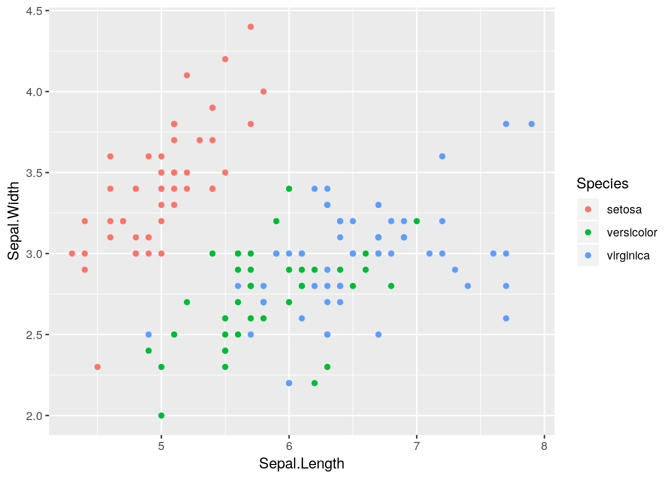
Nice! With one tiny function we have added colours and legends. All nicely formatted to work together in one plot!
Important: Each type of
geomaccepts only a subset of all aesthetics. Information on these can be found in the help files for eachgeom_*type, or see also the Data Visualisation Cheat Sheet. Most of these are fairly obvious. For example, a scatterplot requires bothxandyaesthetics as a minimum. A kernel density geom e.g.geom_density(), requires only anxaesthetic (we will come back to this shortly). Some aesthetics do not make sense for certain types of geom; for example, it makes sense that ashapeaesthetic can be added togeom_point()but not togeom_line(). Conversely, adding alinetypeaesthetic togeom_line()makes sense, but not togeom_point().
1.3.3 Labels and titles
Labels and titles can be added fairly easily, using the xlab(), ylab() and ggtitle() functions:
ggplot(iris) +
    geom_point(aes(x = Sepal.Length, y = Sepal.Width, colour = Species)) +
    xlab("Sepal Length (cm)") + ylab("Sepal Width (cm)") +
    ggtitle("Scatterplot of sepal lengths and widths")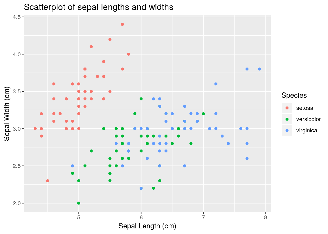
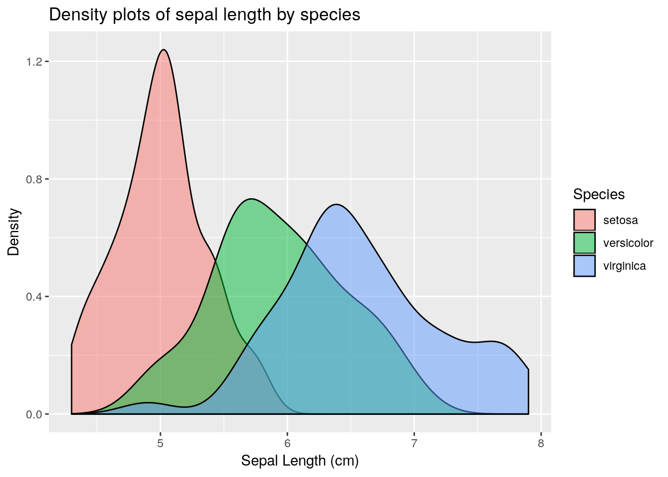
Sepal.Length, stratified by Species. Hint: use the geom_density() geom, which requires an x aesthetic only.
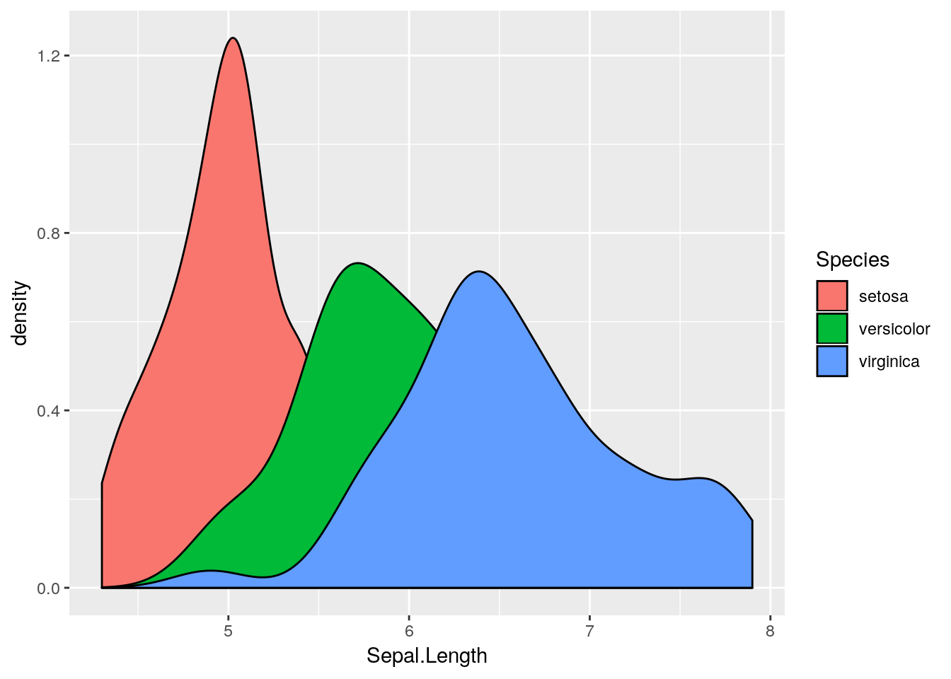
colour aesthetic with a fill aesthetic. What happens?
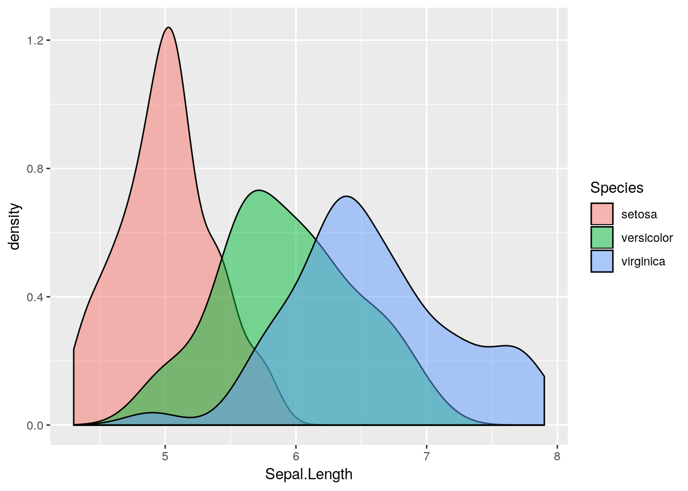
alpha channel to this plot. An alpha channel controls the degree of opacity for the colours, where alpha = 0 corresponds to complete transparency, and alpha = 1 to complete opacity. Note that we do not want to map the alpha channel to an aesthetic here, rather we want all fill colours to be, say 50% transparent. We can therefore add an alpha = 0.5 argument to the geom_density() function. What happens?
1.3.4 Aside: aesthetics vs. generic options
As a quick aside, notice that when we set the alpha channel above, we did not set it as an aesthetic, rather we set it as a generic option which was applied to all components of the plot. Perhaps the easiest way to visualise this difference, is to consider different colour options. Take a look at these next pieces of code and try to understand the differences between them.
ggplot(iris) +
    geom_point(aes(x = Sepal.Length, y = Sepal.Width, colour = Species))
ggplot(iris) +
    geom_point(aes(x = Sepal.Length, y = Sepal.Width), colour = "red")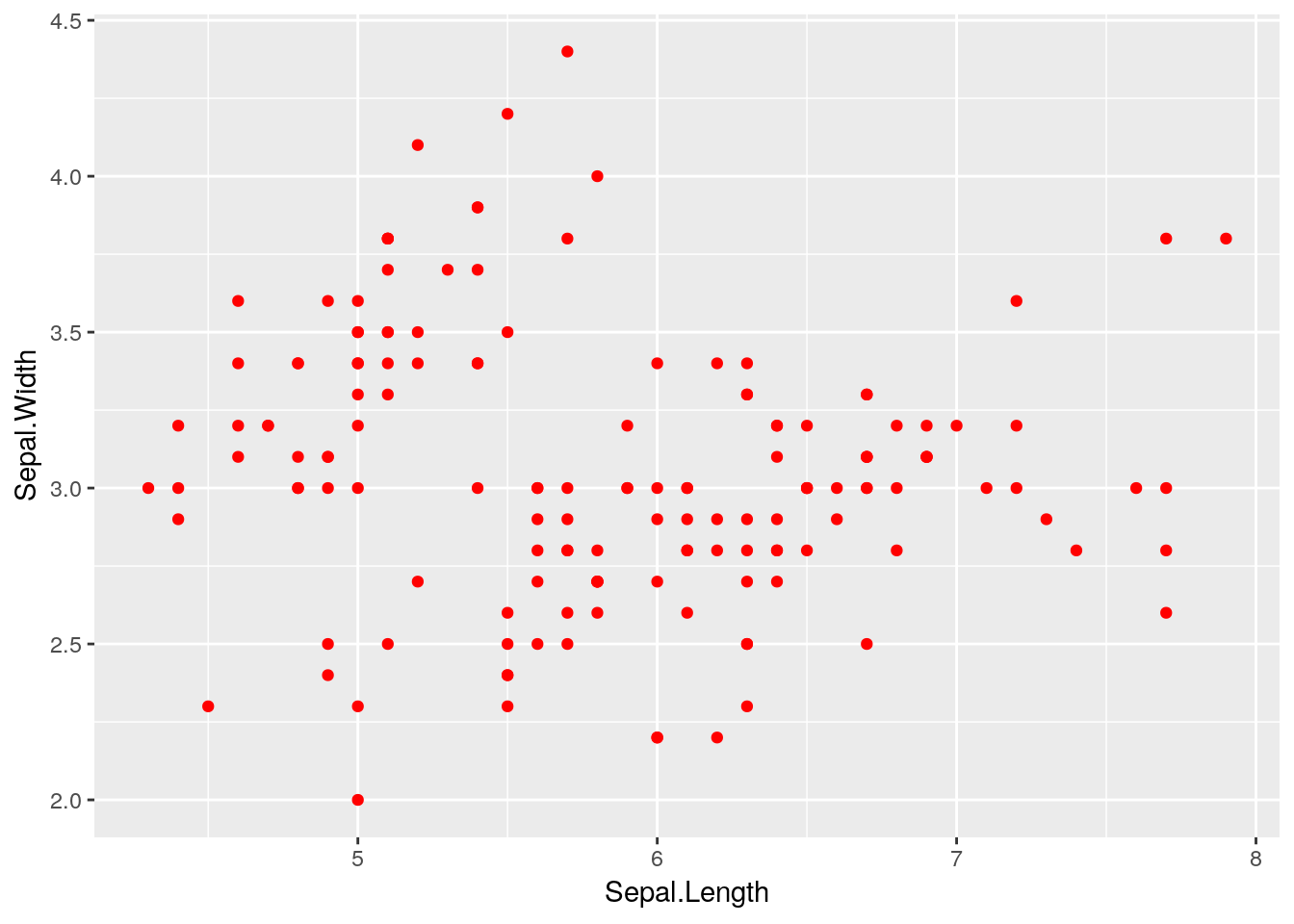
What happens if you try to run the following code?
ggplot(iris) +
geom_point(aes(x = Sepal.Length, y = Sepal.Width), colour = Species)1.3.5 Faceting
Another really useful feature of ggplot is the ability to use faceting to display sub-plots according to some grouping variable. For example, let’s assume that we want to produce separate plots of sepal length vs. width for each of the three species of iris. We can do this using faceting:
ggplot(iris) +
geom_point(aes(x = Sepal.Length, y = Sepal.Width)) +
facet_wrap(~ Species)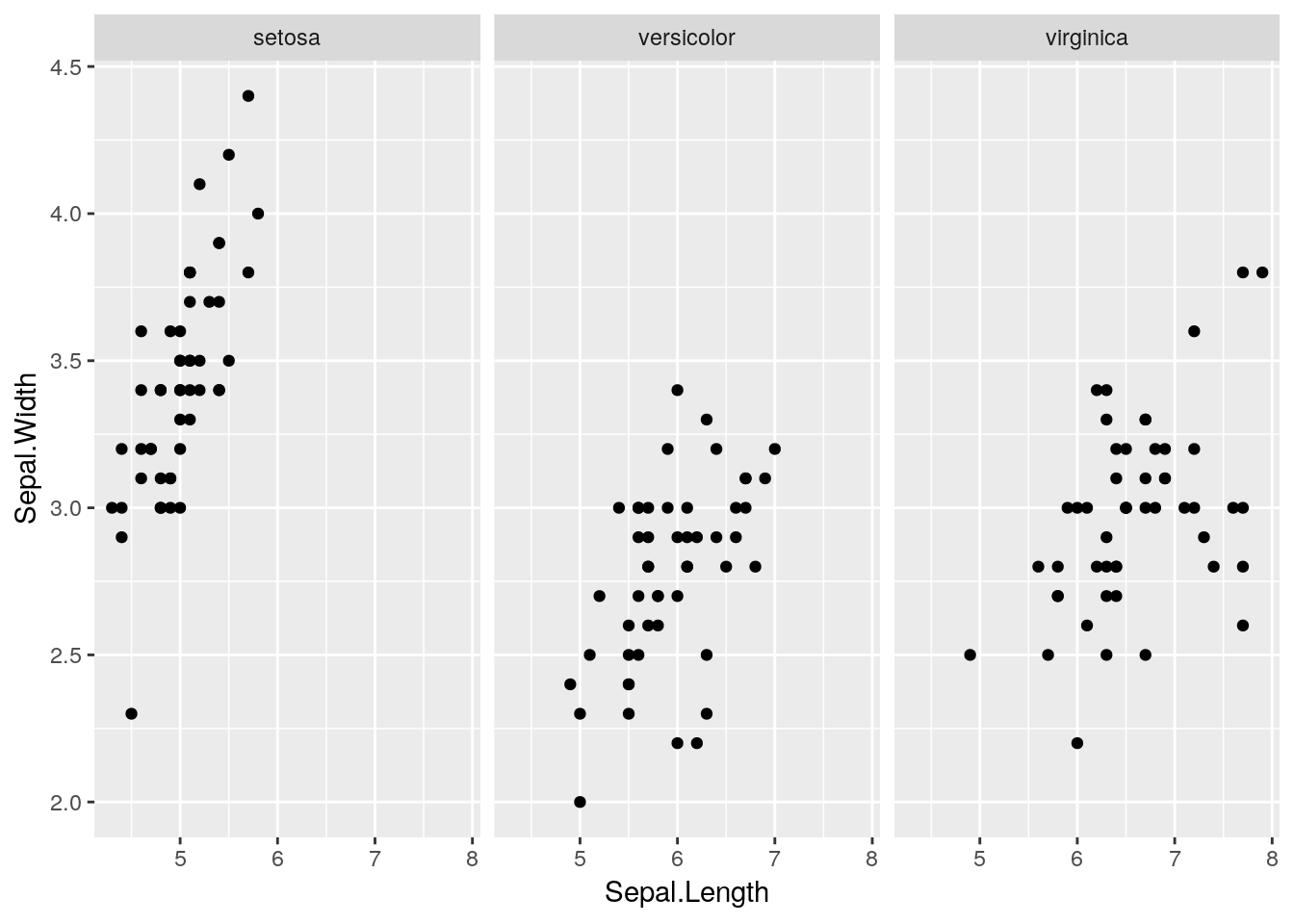 Neat eh? Note that we can also use different aesthetics within the facets. For example, we could also add a
 colour aesthetic e.g.
ggplot(iris) +
    geom_point(aes(x = Sepal.Length, y = Sepal.Width, colour = Species)) +
    facet_wrap(~ Species)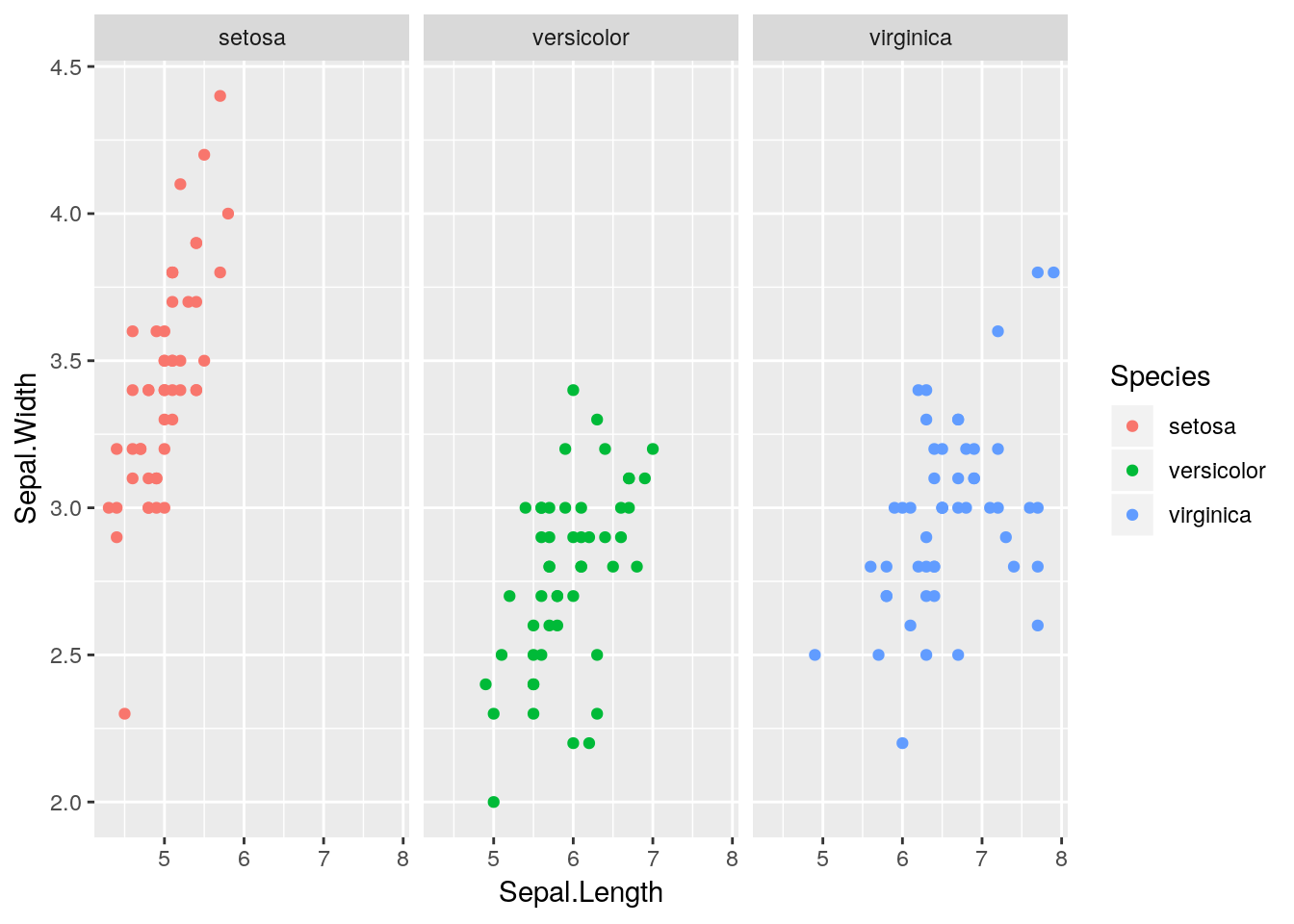
This doesn’t add anything more to the plot here since the colours are redundant. Later we will see a better example of this.
Note there is also a
facet_grid()option that allows us to facet by more than one variable. Please see the Data Visualisation Cheat Sheet for more details.
1.3.6 Statistical transformations
Another feature of ggplot2 is that we can layer transformations over the top of our raw data. For example, there is a stat_smooth() function that allows us to overlay a smoothed non-parametric line to a scatterplot. For example:
ggplot(iris) +
    geom_point(aes(x = Sepal.Length, y = Sepal.Width)) +
    stat_smooth(aes(x = Sepal.Length, y = Sepal.Width))
## `geom_smooth()` using method = 'loess' and formula 'y ~ x'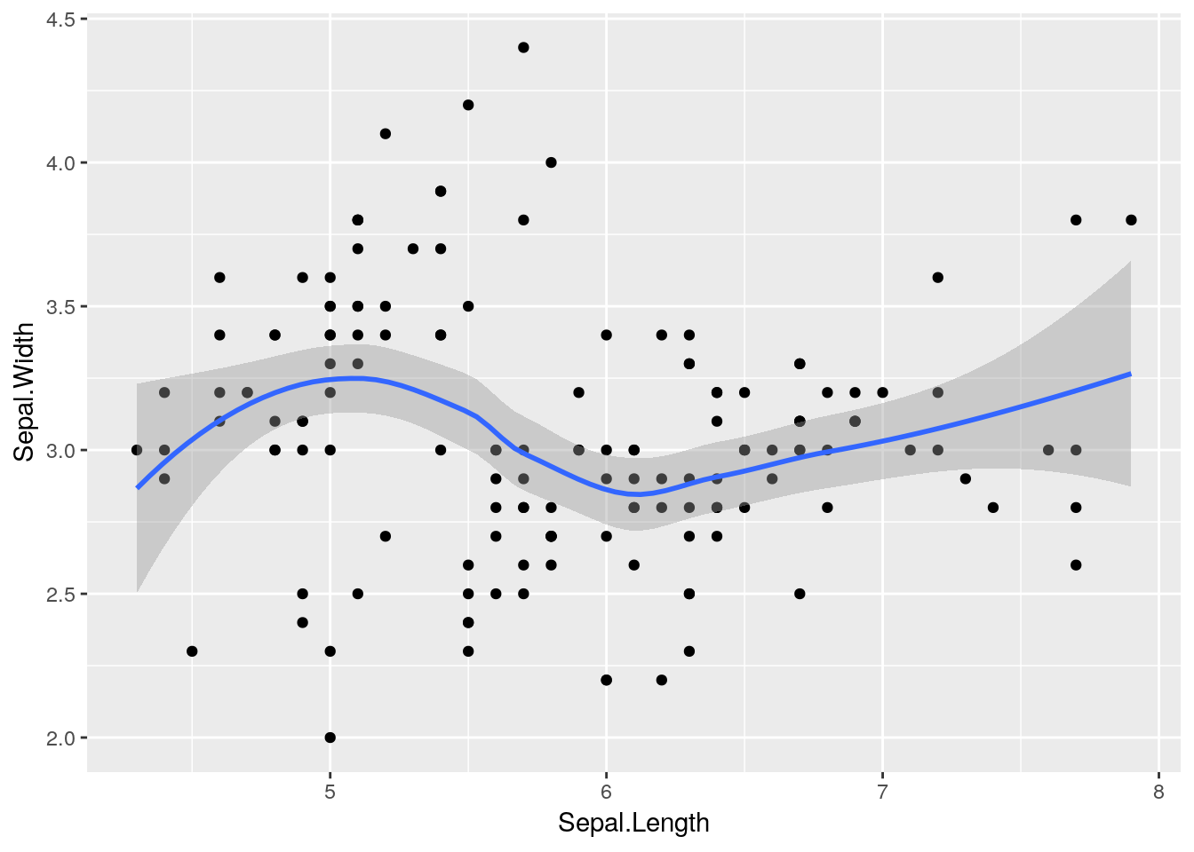 Notice that this has added a
 loess smoothed line to the plot2. We could instead add a linear line if we prefer, by setting a method argument to stat_smooth e.g.
ggplot(iris) +
    geom_point(aes(x = Sepal.Length, y = Sepal.Width)) +
    stat_smooth(aes(x = Sepal.Length, y = Sepal.Width), method = "lm")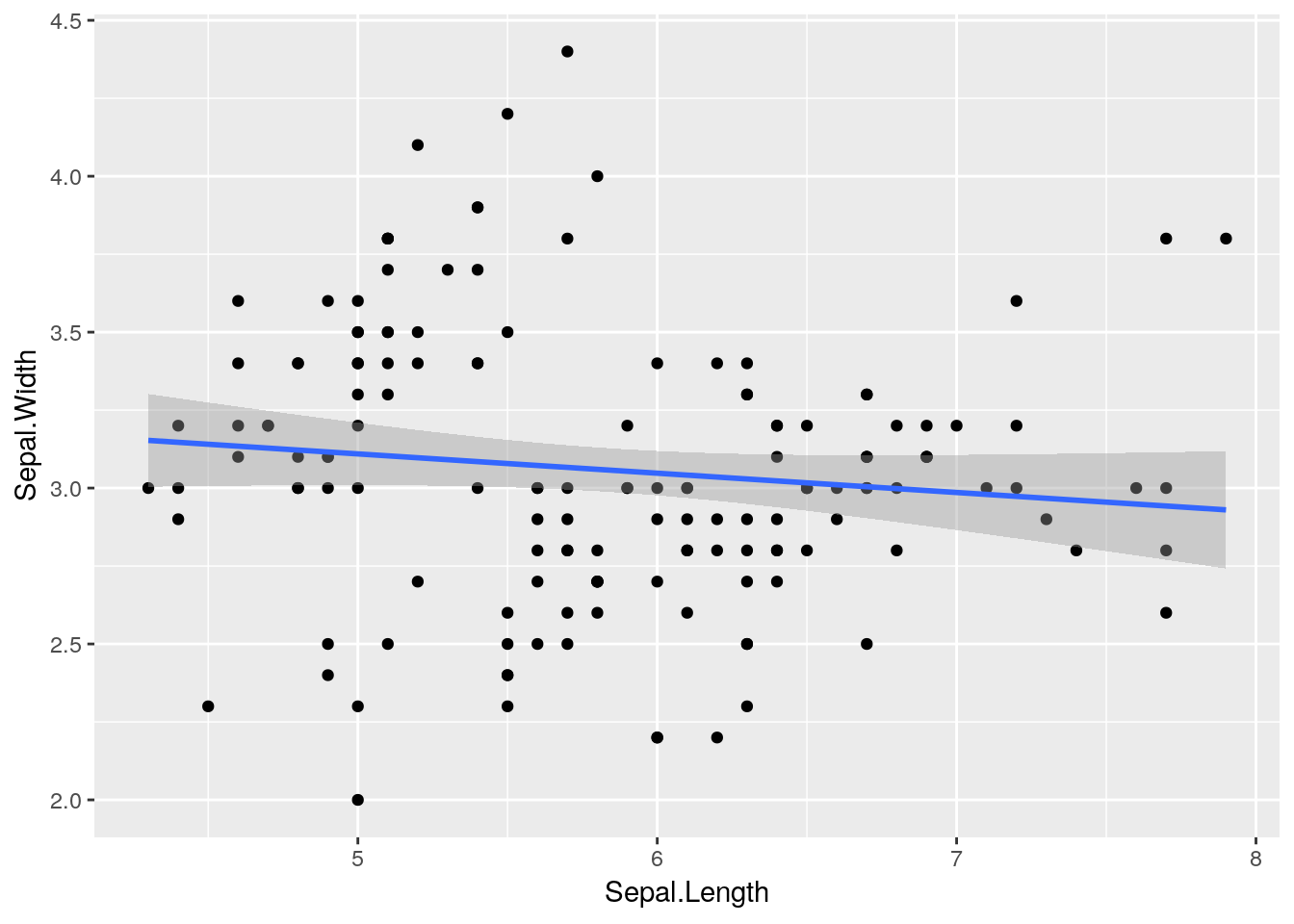
With the addition of a single function we can now add different lines for each species:
ggplot(iris) +
    geom_point(aes(x = Sepal.Length, y = Sepal.Width)) +
    stat_smooth(aes(x = Sepal.Length, y = Sepal.Width), method = "lm") +
    facet_wrap(~ Species)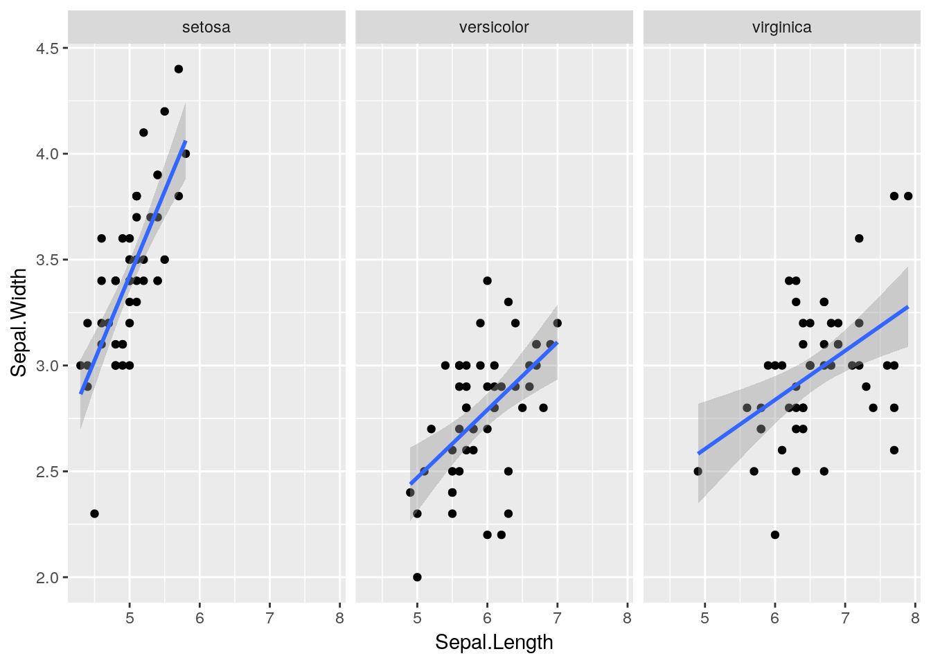
Aside: this is a neat example of Simpson’s Paradox, which an apparent trend in the data disappears or reverses when the trend is explored in subsets of the data. (In this case the linear model suggested a negative correlation between sepal length and width when the species information was ignored, but a positive correlation within each species.)
1.3.7 Aside: “global” vs. “local” options
Notice that in the code below the geom_point() and stat_smooth() functions use the same aesthetics. In this case it is possible to add “global” aesthetics to a plot through the ggplot2() function, which can then be accessed by sub-functions. Hence the following two pieces of code are equivalent here.
ggplot(iris) +
    geom_point(aes(x = Sepal.Length, y = Sepal.Width)) +
    stat_smooth(aes(x = Sepal.Length, y = Sepal.Width), method = "lm") +
facet_wrap(~ Species)ggplot(iris, aes(x = Sepal.Length, y = Sepal.Width)) +
geom_point() +
stat_smooth(method = "lm") +
facet_wrap(~ Species)Mixtures of “global” and “local” aesthetics can be used where necessary, which is particularly useful when layering information from different data sets onto the same plot.
1.3.8 Scales
Scales control the details of how data values are translated to visual properties. These allow us to control translations from data to aesthetics. We will see some simple examples of these in due course.
1.4 A more complex example: Gapminder
Let’s take these ideas and return to our Gapminder data. Datasets from the Gapminder project can be downloaded from https://www.gapminder.org/data. However, the particular data set required to replicate Figure 1.1 is available in a package in R called (naturally) gapminder. If not already installed, then this can be installed in the usual way e.g.
install.packages("gapminder")Once you have it installed we need to load the packages.
library(gapminder)To have a quick look at the data, which are available as an object called gapminder.
gapminder## # A tibble: 1,704 x 6
## country continent year lifeExp pop gdpPercap
## <fct> <fct> <int> <dbl> <int> <dbl>
## 1 Afghanistan Asia 1952 28.8 8425333 779.
## 2 Afghanistan Asia 1957 30.3 9240934 821.
## 3 Afghanistan Asia 1962 32.0 10267083 853.
## 4 Afghanistan Asia 1967 34.0 11537966 836.
## 5 Afghanistan Asia 1972 36.1 13079460 740.
## 6 Afghanistan Asia 1977 38.4 14880372 786.
## 7 Afghanistan Asia 1982 39.9 12881816 978.
## 8 Afghanistan Asia 1987 40.8 13867957 852.
## 9 Afghanistan Asia 1992 41.7 16317921 649.
## 10 Afghanistan Asia 1997 41.8 22227415 635.
## # … with 1,694 more rowsHere we can see that the data set consists of 1704 rows and 6 columns, and contains information on country, continent, life expectancy, population size, GDP (per capita) and year.
The R aficionados amongst you might notice the slightly strange
gapminderobject. If we try todata.frameobject to the screen, then it usually prints the whole object. Here it’s printed an attenuated version of the object. This is because thegapminderdata set is saved as atibbleobject, rather than a standarddata.frame.
Aside: A
tibbleis an enhanceddata.frameobject which are generally easier to examine. For example, they force R to display only the data that fits onscreen. It also adds some information about the class of each column. In fact, thetibblepackage—loaded as part of thetidyverse—introduces theas_tibble()function to convert ordinarydata.frameobjects totibbleobjects, in case you want to use this functionality in future. Please see the Data Import Cheat Sheet for more information.Note also that
tibbleobjects seem to make a distinction between integers (<int>) and doubles (<dbl>), instead of just usingnumeric. R makes no such distinction in practice, and so you can think of either of these as simplynumerictypes.We’ll use
tibblesmore generally in the later data wrangling session.
Let’s just clarify the data:
country: country of interest (factor);continent: continent country can be found in (factor);year: year corresponding to data (in increments of 5 years) (numeric);lifeExp: life expectancy at birth (in years) (numeric);pop: population size (numeric);gdpPercap: GDP per capita, in dollars, by Purchasing Power Parities and adjusted for inflation (numeric).
1.4.1 GDP against life expectancy
Let’s think about Figure 1.1 and try to map the various aesthetics in the plot to our data set. We have:
| Aesthetic | Variable |
|---|---|
x |
gdpPercap |
y |
lifeExp |
colour |
continent |
size |
pop |
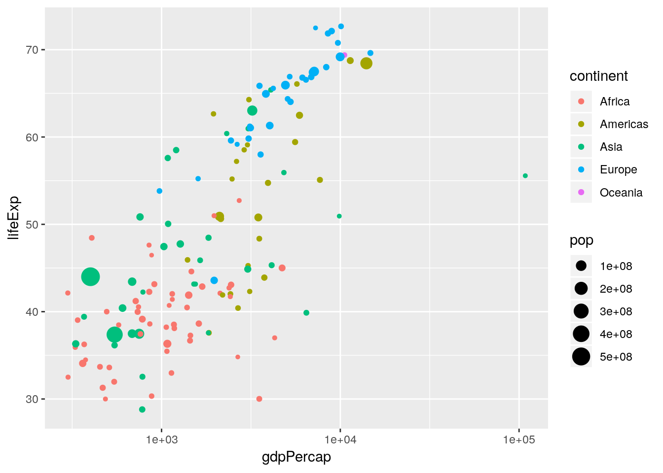
ggplot2, produce a scatterplot that uses the aesthetics in Table 1.1 for just the year 1952.
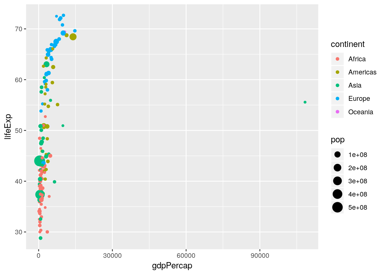
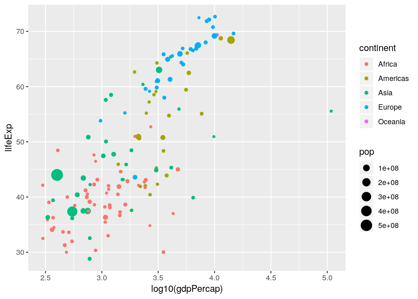
Notice how rich this plot is already. One thing to note is that in Figure 1.1 the \(x\)-axis is plotted on the \(\log_{10}\) scale. There are two ways in which we can handle this: either by transforming the gdpPercap variable directly, or by using an appropriate scales_* function. Here we want to apply a \(\log_{10}\) transformation to the x aesthetic.
- Redo the previous plot but with the aesthetic
x = log10(gdpPercap). - Redo the previous plot with the aesthetic
x = gdpPercapbut with an additionalscale_x_log10()layer.
Important:
ggplot2also allows you to save the plot as an object, which can be updated at a later date or used within other functions. For example,p <- ggplot(gapminder[gapminder$year == 1952, ], aes(x = gdpPercap, y = lifeExp, size = pop, colour = continent)) + geom_point()creates an object called
pthat contains the plot information. This will not be plotted until the object is printed to the screen e.g.p
Note: If using
ggplotinside functions you may have to explicitly use theprint()function (e.g.print(p)).This can be useful if we want to add things to an existing plot at a later stage without having to rewrite the entire plot. For example, to set the scales on plot
pwe can do:p <- p + scale_x_log10() p

ggplot2 has lots of built in transformations e.g. "log", "exp", "sqrt", "log10" and so on. Or you can define your own. Notice that we have not transformed the data, we have merely told ggplot() on what scale to plot it. This sorts out the axis tick labelling automatically.
We can also scale other aesthetics. For example, although the relative areas of the points are scaled nicely, we probably want the largest points to be slightly larger. Hence we can scale the area of the maximum point by using the scale_size_area() function:
p <- p + scale_size_area(max_size = 10)
p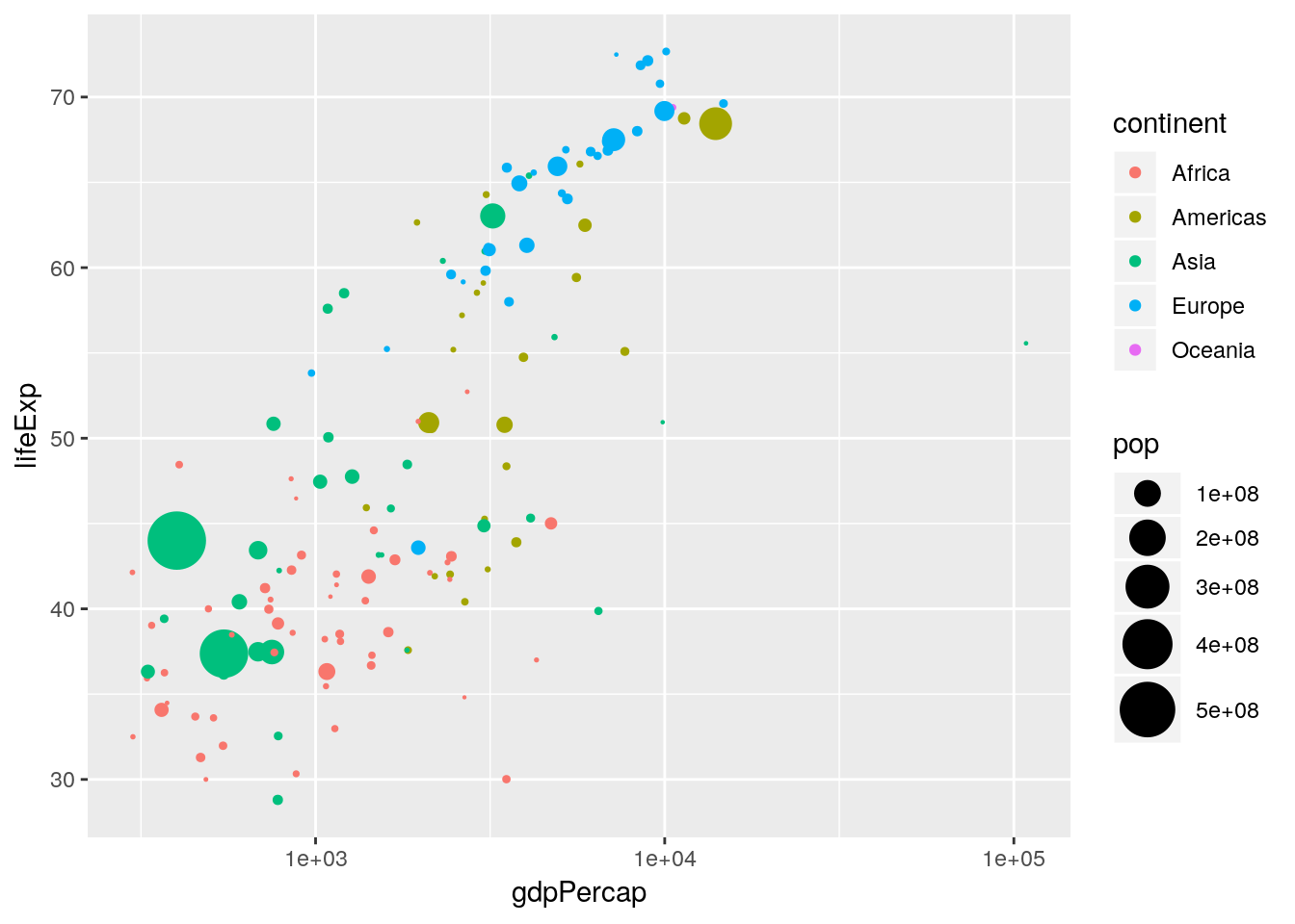
Again, labels and titles can be added fairly easily, using the xlab(), ylab() and ggtitle() functions:
p <- p + xlab("log10(GDP per capita)") +
    ylab("Life expectancy at birth (years)") +
    ggtitle("1952")
p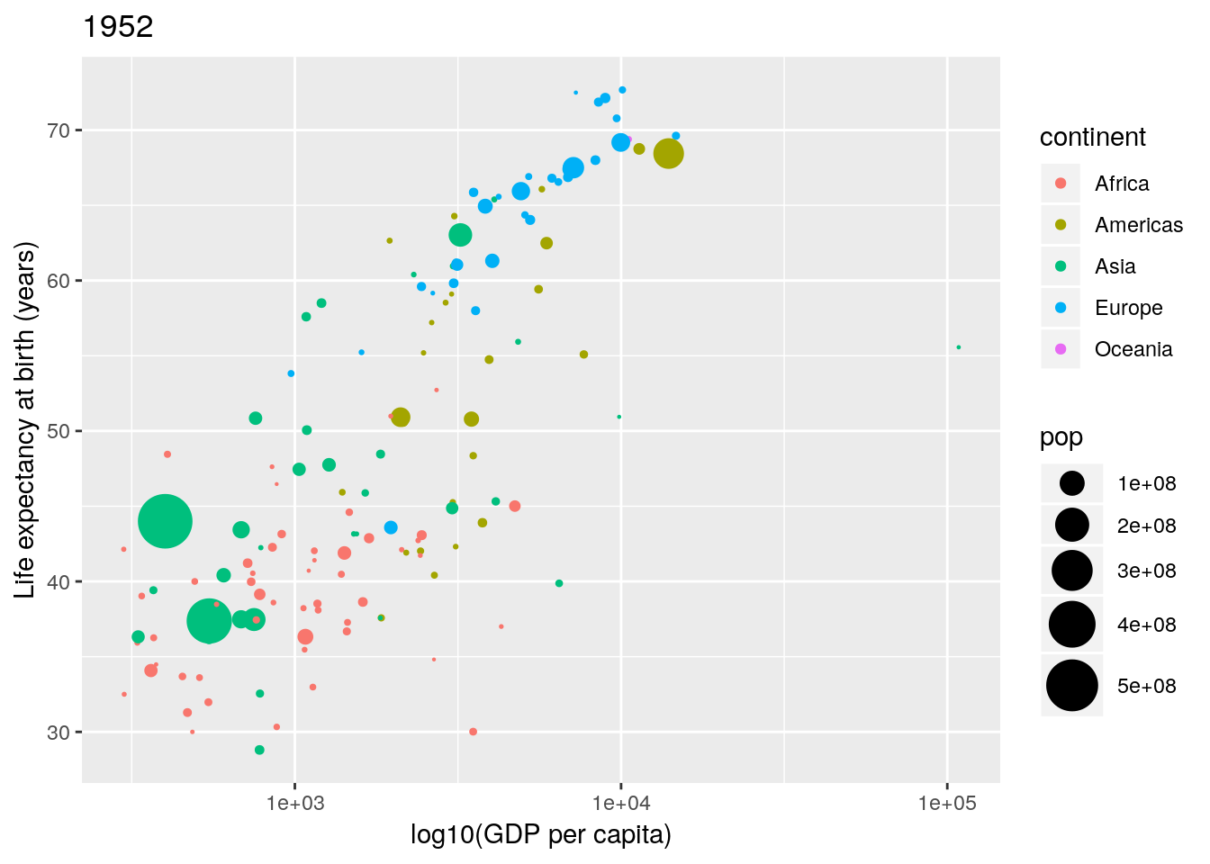
Changing the legend titles can also be done using the labs() option. Notice that the legends map to the aesthetics, so there is a colour legend that maps to the colour aesthetic, and a size legend that maps to the size aesthetic.)
p <- p + labs(colour = "Continent", size = "Population size")
p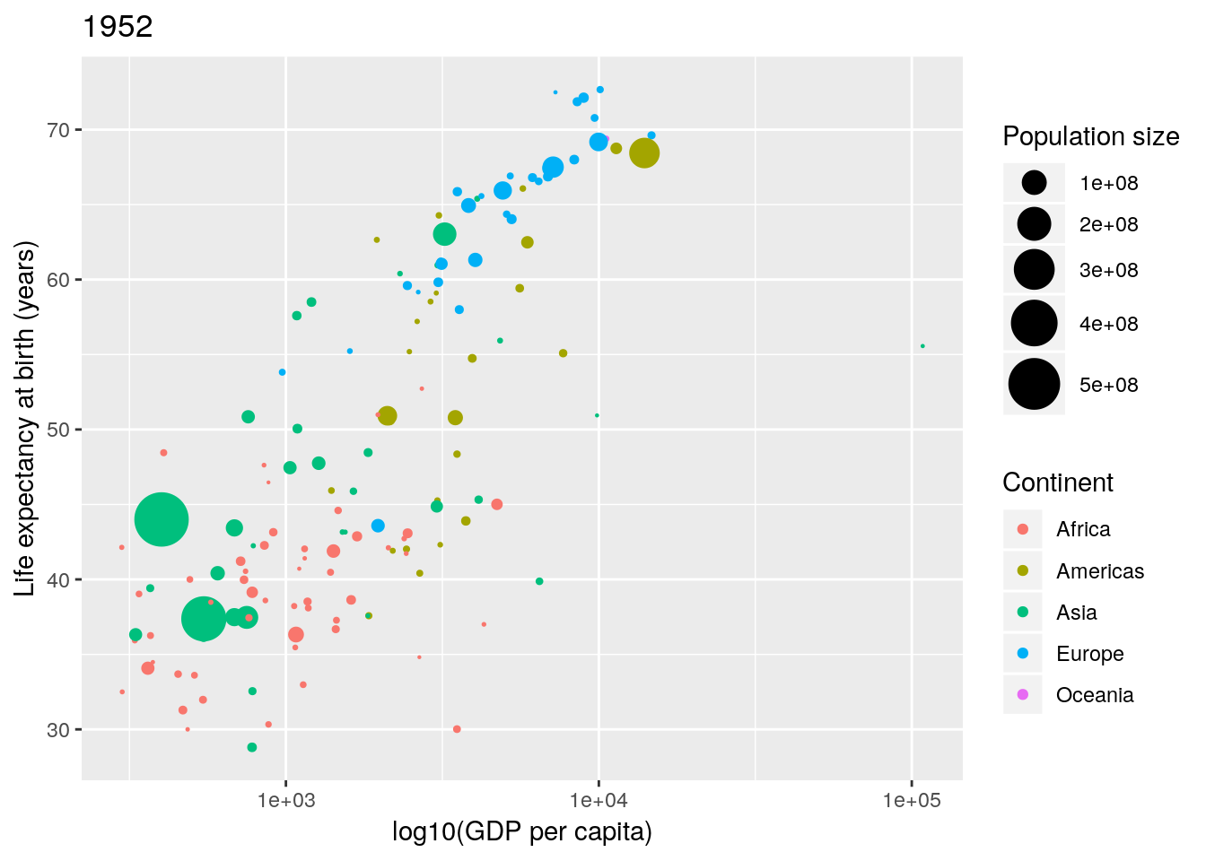
Not bad. Finally notice that by default ggplot2 uses a light-grey background. This seems to prove somewhat divisive. There is a solid theory behind choosing this as the default, since it provides clarity without having too much contrast. However, some people don’t like it, and so there are options to turn this off (using theme()). In this case we can simply turn this off using theme_bw() (a black-and-white theme).
p <- p + theme_bw()
p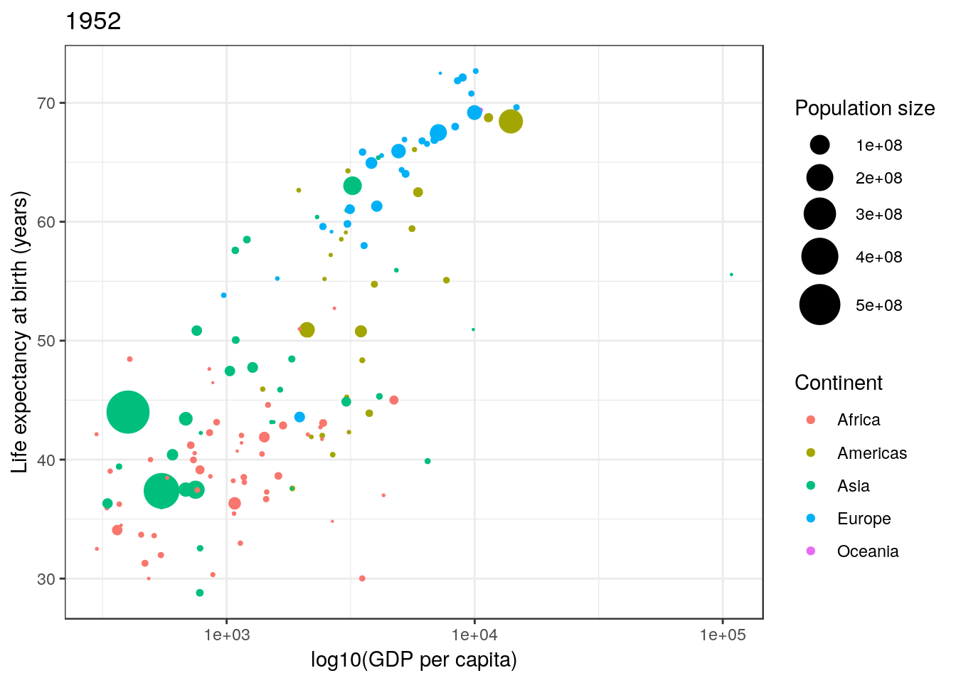
There are many, many possible options with ggplot2. Far too many to cover here. We can only really get a flavour of what can be achieved. I have often found Google to be invaluable for learning ggplot2.
Let’s have a look at a couple of other examples.
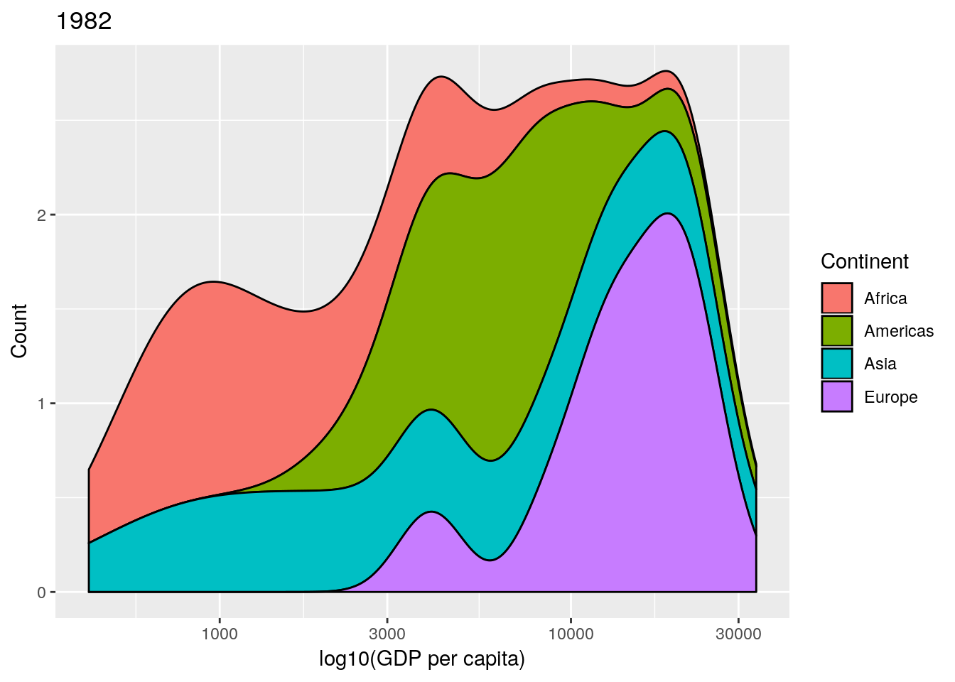
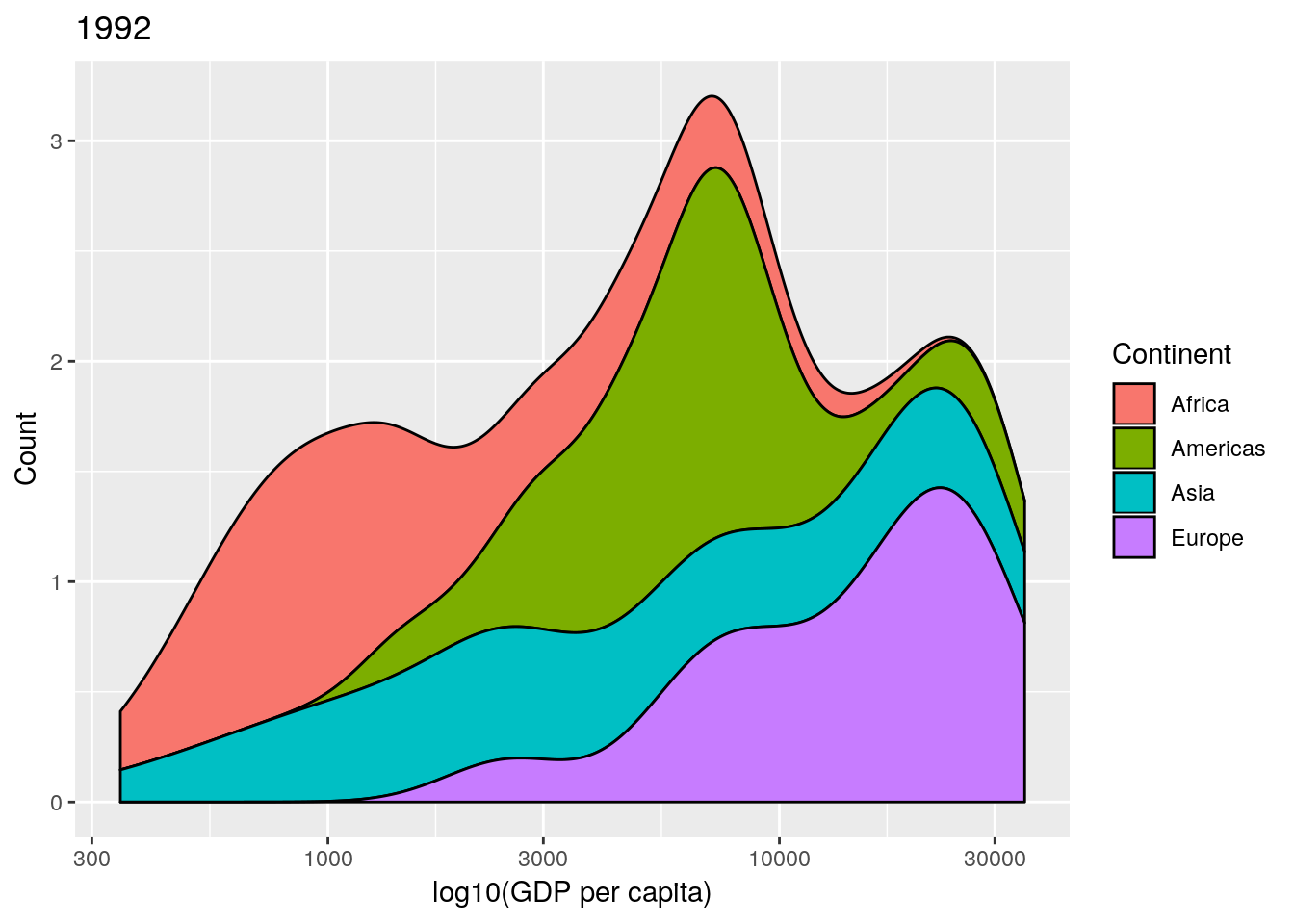
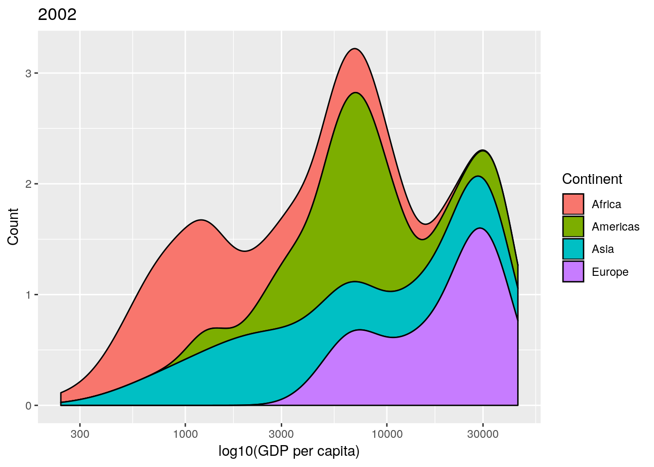
1.4.2 GDP per continent
Another chart seen in Professor Rosling’s TED talk was a stacked density plot. This is a smoothed version of a histogram. Let’s start by looking at the distribution of GPD values across all countries in 1952. This can be done with the geom_density() geom as in the earlier example, which requires only an x aesthetic—see ?geom_density—since it calculates the density on the \(y\)-axis automatically from the data once we have chosen an appropriate bandwidth.
ggplot(gapminder[gapminder$year == 1952, ],
       aes(x = gdpPercap)) +
    geom_density() +
    scale_x_log10()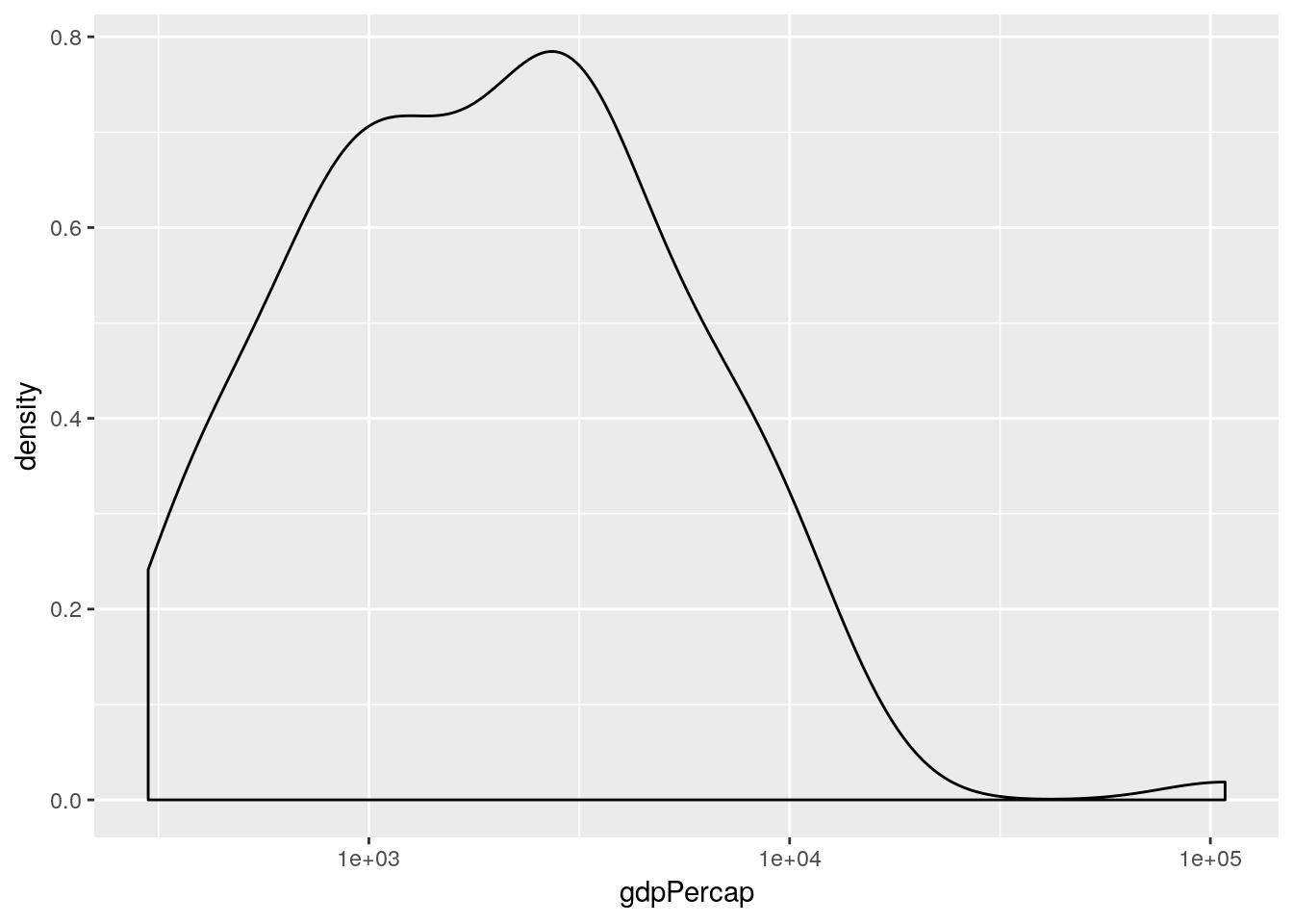
This simple plot is producing a density plot of the distribution of GDP across all countries in 1952. How do split this by continent? Well, there are various ways. One way would be to set the fill aesthetic to map to the continent variable:
ggplot(gapminder[gapminder$year == 1952, ],
       aes(x = gdpPercap, fill = continent)) +
    geom_density() +
    scale_x_log10()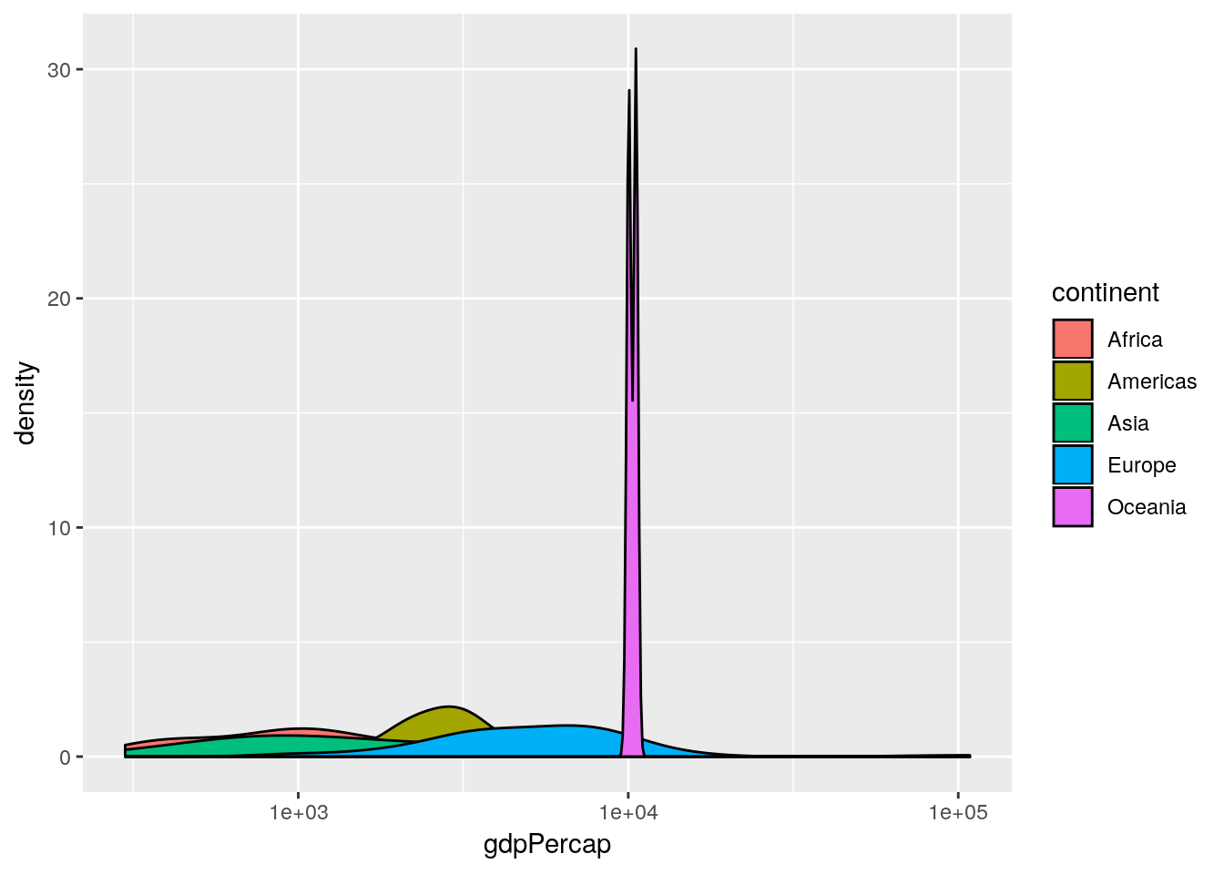
This produces an overlapped density plot by default. (The patterns are quite difficult to see here, due to the Oceania data, so for the purposes of exposition only we’re going to remove Oceania from the subsequent plots.)
## remove Oceania (for exposition purposes only)
gapminderNoOc <- gapminder[gapminder$continent != "Oceania", ]

## produce overlapped density plot
ggplot(gapminderNoOc[gapminderNoOc$year == 1952, ],
       aes(x = gdpPercap, fill = continent)) +
    geom_density(alpha = 0.5) +
    scale_x_log10()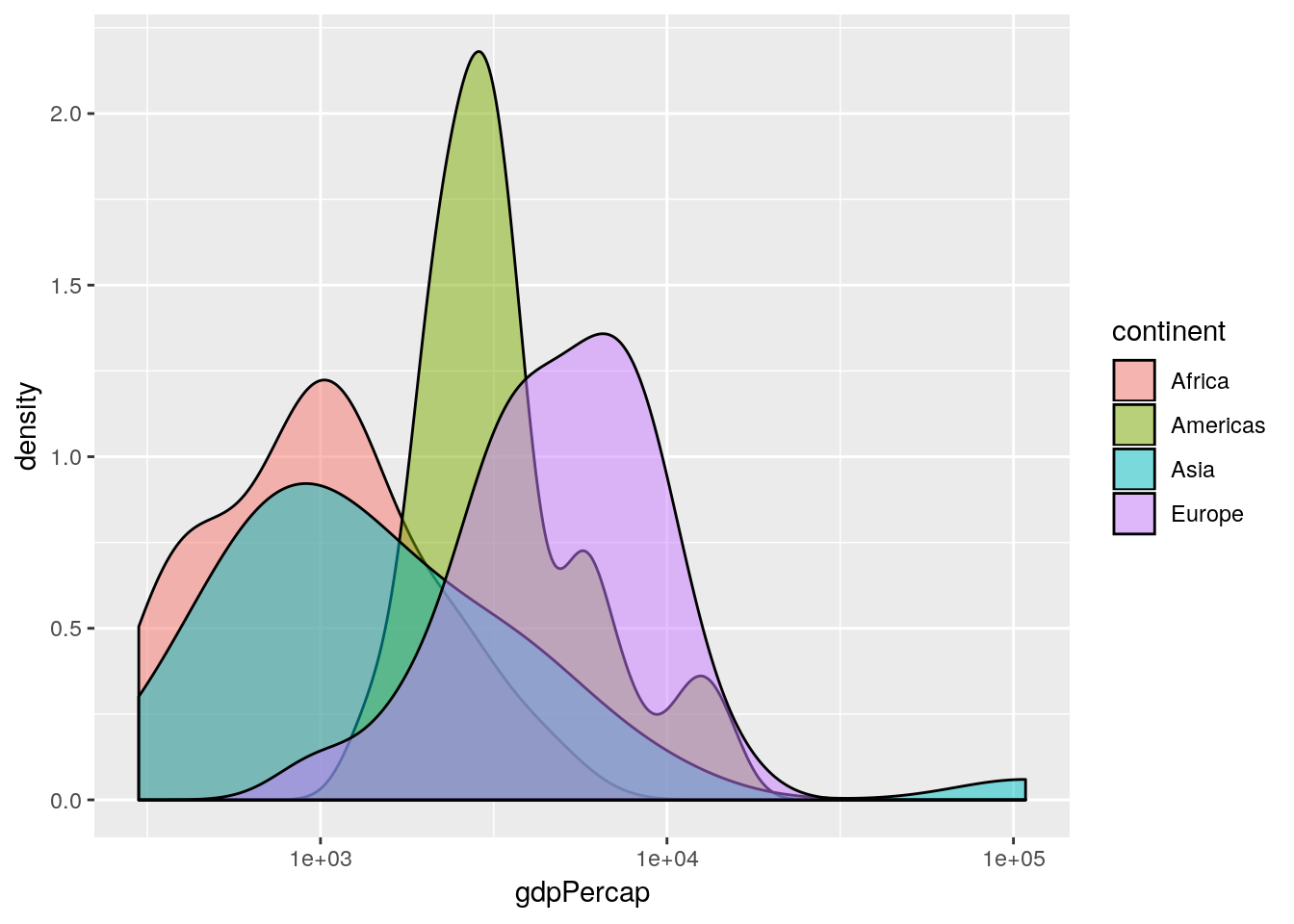
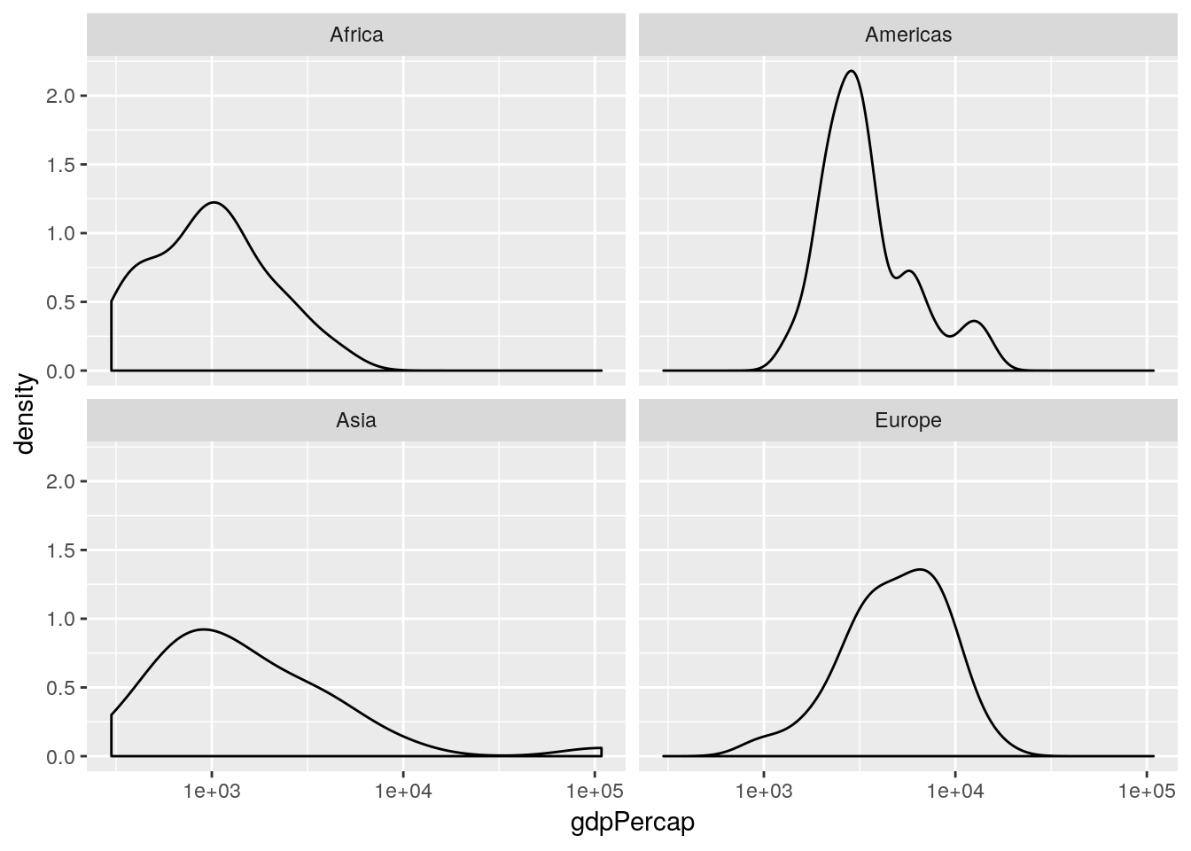
This is an informative plot. We can see that African countries tend to have lower GDP per capita than the Americas for example; with Asia and Africa the poorest continents in the 1950s in terms of GDP.
Aside: what does the
Oceaniadensity plot tell us about the range of GDPs in the Oceania continent?
1.4.2.1 Positions
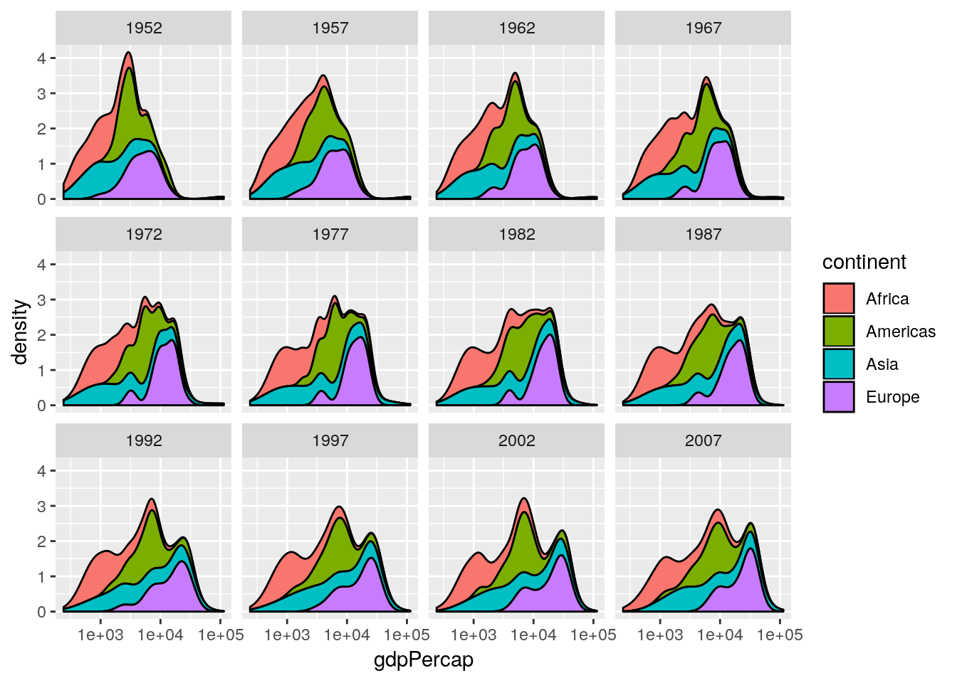
Professor Rosling uses a stacked density plot, rather than overlapping density plots. We can use a position = "stack" argument to the geom to force the stacking.
## produce stacked density plot
ggplot(gapminderNoOc[gapminderNoOc$year == 1952, ],
       aes(x = gdpPercap, fill = continent)) +
    geom_density(position = "stack") +
scale_x_log10() 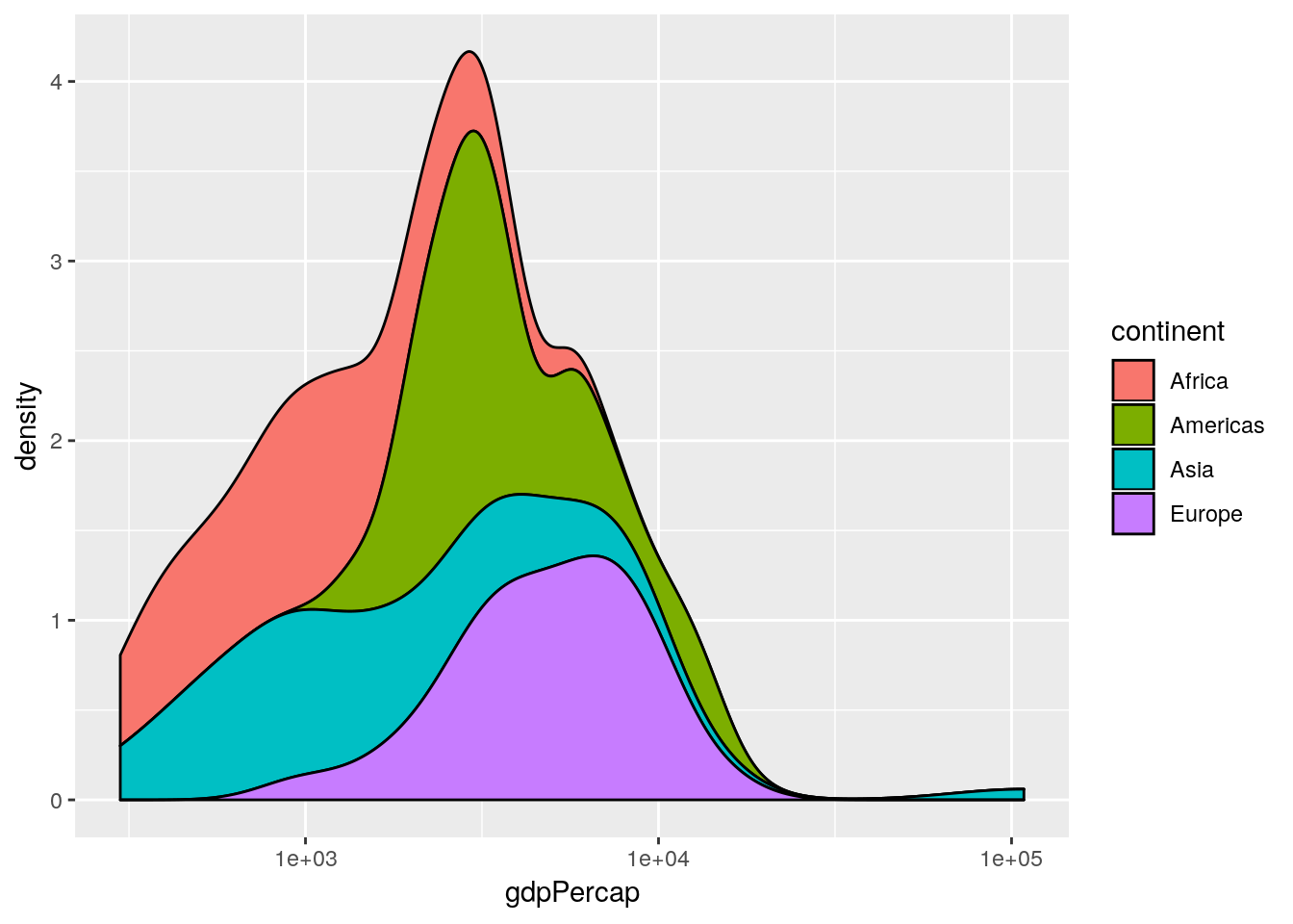
Histograms and barplots have equivalent position = "dodge" and position = "stack" commands. By default histograms use the latter. The former is not very useful for histograms, but very useful for barplots with multiple discrete groupings.

data and a year argument and plots a stacked density plot for a given year. Use this to plot the data for 1952, 1982, 1992 and 2002. (Remember that if you want to plot a ggplot2 figure from inside a function, you will have to call print() explicitly.)

log10(gdpPercap) faceted by continent, for the year 1952.
1.5 Additional task
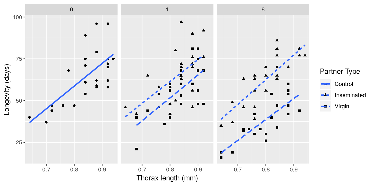
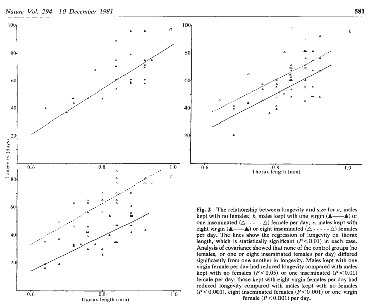
A cost of increased reproduction in terms of reduced longevity has been shown for female fruitflies, but not for males. We have data from an experiment that used a factorial design to assess whether increased sexual activity affected the lifespan of male fruitflies.
The flies used were an outbred stock. Sexual activity was manipulated by supplying individual males with one or eight receptive virgin females per day. The longevity of these males was compared with that of two control types. The first control consisted of two sets of individual males kept with one or eight newly inseminated females. Newly inseminated females will not usually remate for at least two days, and thus served as a control for any effect of competition with the male for food or space. The second control was a set of individual males kept with no females. There were 25 males in each of the five groups, which were treated identically in number of anaesthetizations (using \(\mathrm{CO}_2\)) and provision of fresh food medium.
The data should have the following columns:
- id: a ID for each fly in each group (1–25).
- partners: number of companions (0, 1 or 8).
- type: type of companion (inseminated female; virgin female; not applicable (when ‘partners = 0’)).
- longevity: lifespan, in days.
- thorax: length of thorax, in mm.
Source: Partridge and Farquhar (1981)
The file “ff.rds” contains the data from this experiment. Download this data set to your working directory, read it into R using the command:
ff <- readRDS("ff.rds")and use ggplot2 to reproduce something similar to the plot below:
 .
.